
Lab: Mobile Responsive Layout Design
Estimated time: 45 minutes
What you will learn
In this lab, you will learn how to take your existing desktop layout created in the previous lab (Designing Microinteractions) and make it responsive for mobile devices. You'll apply Figma's Auto Layout tools, responsive constraints, and resizing behaviors to ensure your UI adapts fluidly across different screen sizes. This hands-on experience will teach you how to maintain usability and design consistency, whether your interface is viewed on desktop, tablet, or mobile.
Learning objectives
By the end of this lab, you will be able to:
Understand the concept of responsive design in Figma
Apply Auto Layout and constraints to frames and elements
Use wrapping and fill container options to manage resizing
Adjust typography and spacing for small screens
Preview and test mobile responsiveness using Figma's presentation mode
Prerequisites
Completion of previous lab: Designing Microinteractions in Figma
Basic knowledge of frames, text, auto layout, and variant usage
Introduction
In the real world, users access websites and apps from a variety of devices. It's no longer enough to design only for desktop—designs must adapt gracefully to smaller screens like tablets and mobile phones. In this lab, you will transform your existing HealthyGlow desktop layout into a responsive version. You'll practice using Auto Layout, constraints, and Figma's resizing options to ensure your microinteraction-based components display well on different viewports.
Scenario
Design brief
You are continuing the design for HealthyGlow, the organic skincare e-commerce website. Previously, you created product cards with interactive heart icons and add-to-cart buttons. Now, users have started using HealthyGlow on mobile, so you must ensure these elements remain functional and visually appealing when viewed on mobile devices. Your task is to restructure the layout using Auto Layout and responsive behaviors so that the design is mobile-ready.
Part 1: Set Up Your Mobile Workspace
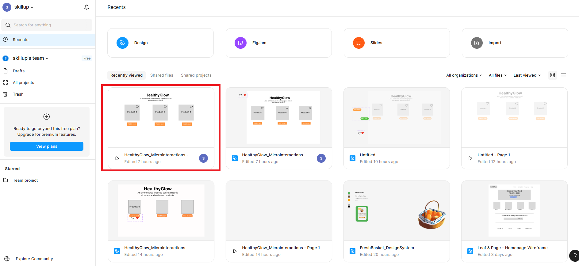
Open your previous Figma file: HealthyGlow_Microinteractions
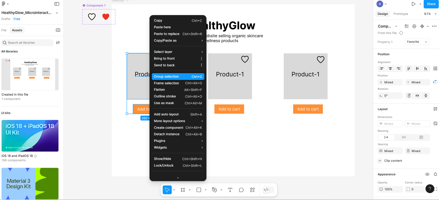
Within the frame, select the product card, product name, add-to-cart button, and heart icon together by holding the Shift key, then right-click.. You need to click on Group Selection. Repeat this process with all the other products and their related items as well.
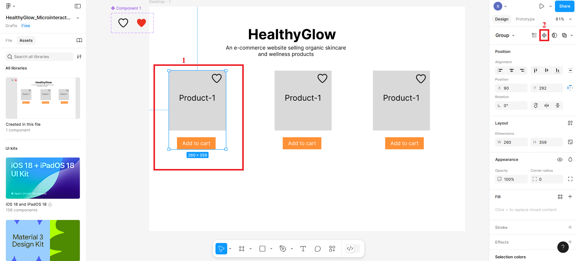
Now select the first product card that you grouped together and then create a component by clicking the icon labelled 2 in the given screenshot.
Create the rest of the grouped product cards as components.
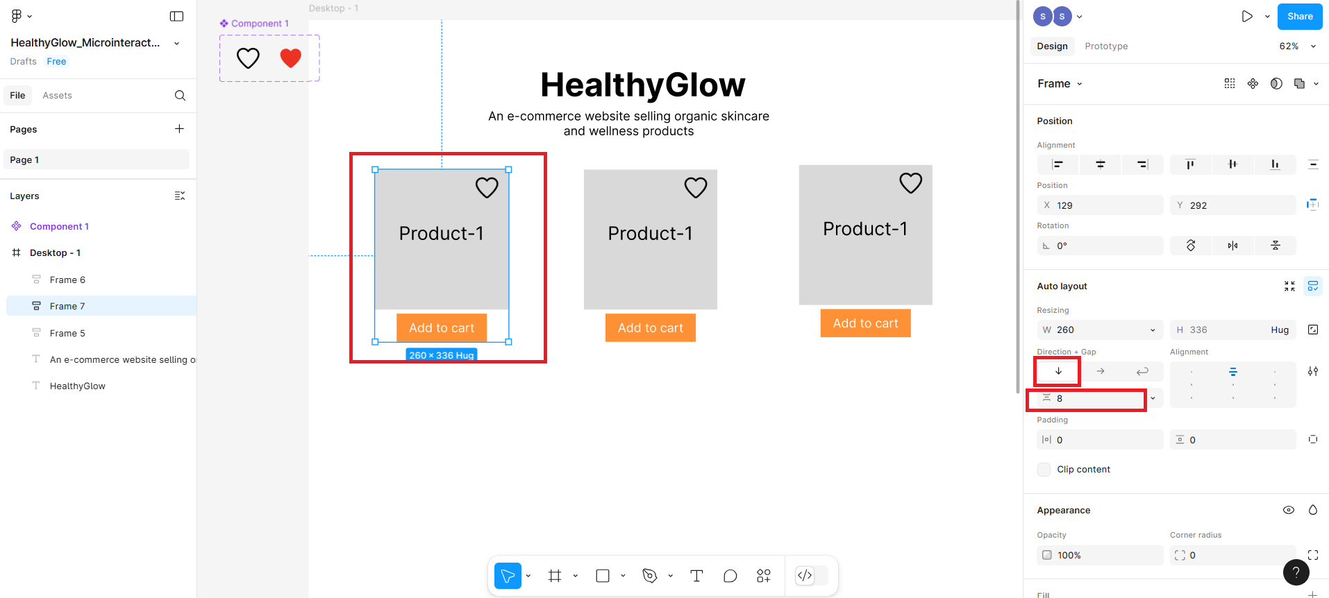
Then, select the first component and press Shift + A. On the right-hand sidebar, the Auto Layout will be visible. Make sure the direction is in the vertical side and also fill the spacing between them as 8.
Repeat the above step for the rest of the product components as well.
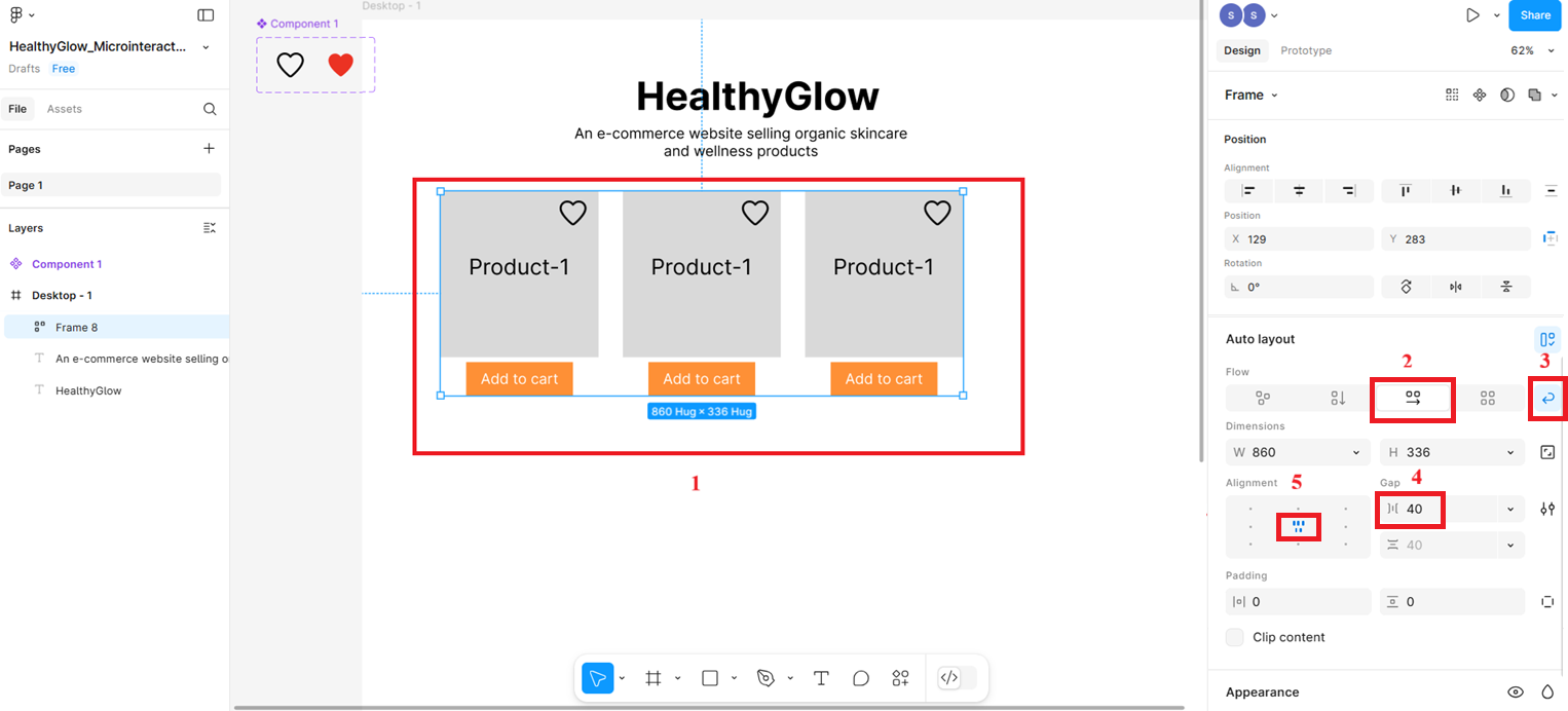
Now select all 3 product cards and press Shift + A again to wrap them in an auto layout row.
- In the Auto Layout settings (right panel):
Set Direction: Horizontal (highlighted as 2 in screenshot)
Enable Wrap (for responsiveness on small screens) (highlighted as 3 in screenshot)
Set Gap between items: e.g., 40px (highlighted as 4 in screenshot)
Set Alignment: Center (highlighted as 5 in screenshot)
- In the Auto Layout settings (right panel):
Part 2: Make the Layout Responsive
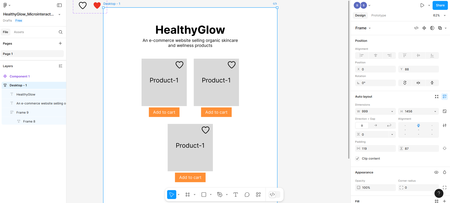
- Now you need to apply Auto Layout to the parent container, which is Desktop-1.
- Select the Desktop-1 and press Shift + A,. It will open the auto layout where you need to make the direction vertical.
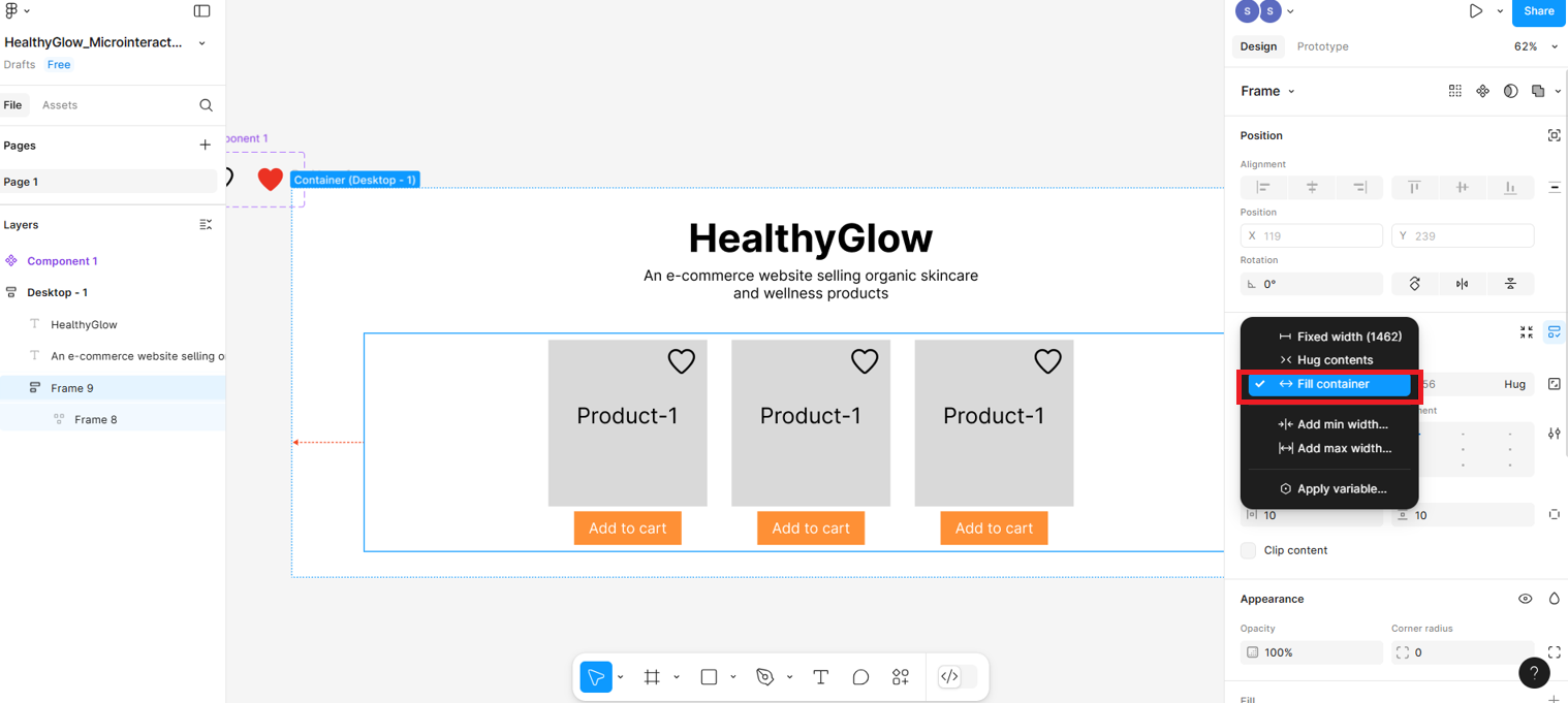
Now select the frame that holds the three product cards and press Shift + A again, then click on the width to see the options, from where you will select Fill the container.
After performing the above steps, resize the Desktop-1 (parent frame) width to
999, as shown in the screenshot below, to verify whether the products are behaving correctly for mobile responsiveness.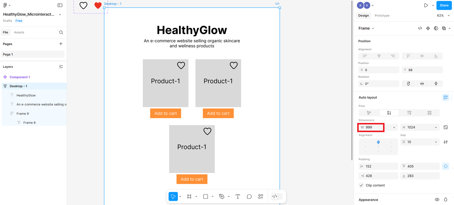
This is the responsive layout displayed when you reduce the size of the parent frame. You can set the width to
542, as shown in the screenshot below.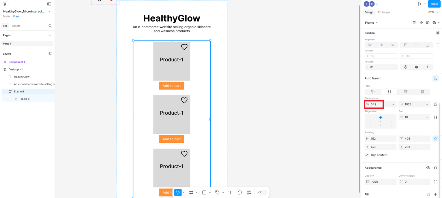
Summary
In this lab, you learned:
How to use Auto Layout in Figma to make UI components adapt fluidly across different screen sizes.
How to apply Wrap behavior to a horizontal auto layout row so that product cards stack vertically when the screen width reduces.
How to use Fill Container on a frame so it stretches to fill the width of its parent container responsively.
How to test mobile responsiveness by resizing the Desktop-1 parent frame and verifying that elements reflow correctly at different widths (999px and 542px).
The importance of responsive design in ensuring a consistent and usable experience across desktop, tablet, and mobile devices.
Author(s)
Richa Arora