
Lab: Grid-Based Wireframe Design
Estimated time: 45 minutes
What you will learn
This lab is designed to equip learners with practical skills in applying grid systems to create structured, user-centric wireframes for websites and mobile applications. Through hands-on exercises, learners will gain a deeper appreciation of how grids contribute to visual consistency, alignment, and responsive design.
Learning objectives
By the end of this lab, you will be able to:
Explain the purpose and underlying structure of grid systems in UI/UX design, including column grids, gutters, and margins.
Construct a well-defined grid layout using industry-standard design tools such as Figma.
Develop a low-fidelity, responsive wireframe that adheres to a predefined grid system, ensuring consistency across devices.
Critically evaluate and justify layout decisions based on principles of usability, spacing, alignment, and visual hierarchy.
Prerequisites
Basic understanding of UI design and layout principles.
Familiarity with wireframing tools like Figma.
*Note: If this is your first time using Figma, we recommend creating an account. To do this, right-click Getting Started with Figma and open it in a new tab to sign up.
Introduction
In today's multi-device world, digital products must look clean, work seamlessly, and feel intuitive—whether viewed on a desktop, tablet, or phone. One of the unsung heroes that helps designers achieve this is the grid system. It provides structure, rhythm, and alignment to UI layouts, making interfaces both aesthetically pleasing and functionally effective.
This lab will walk you through the process of designing wireframes using a grid system, a foundational skill every UI/UX designer must master. Think of the grid as the invisible skeleton of your design—it guides where things should go, helps maintain balance, and ensures consistency across pages and screen sizes.
Scenario
Design brief
You've just been hired by the Leaf & Page organization, a new online bookstore launching its website. They need a clean, user-friendly homepage wireframe to showcase featured books, categories like fiction and non-fiction, and a newsletter signup.
Your job is to create a low-fidelity wireframe using a grid system to ensure clean alignment, consistent spacing, and a responsive layout. The focus is on structure, not visuals—so stick to simple blocks and placeholder text.
Getting started
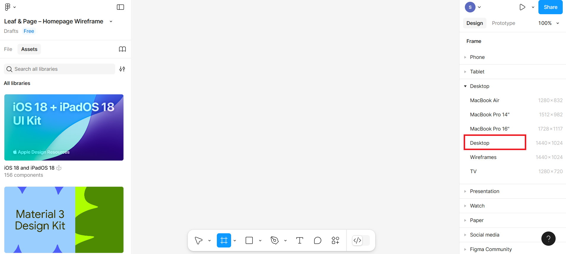
Step 1: Open Figma and create a new file
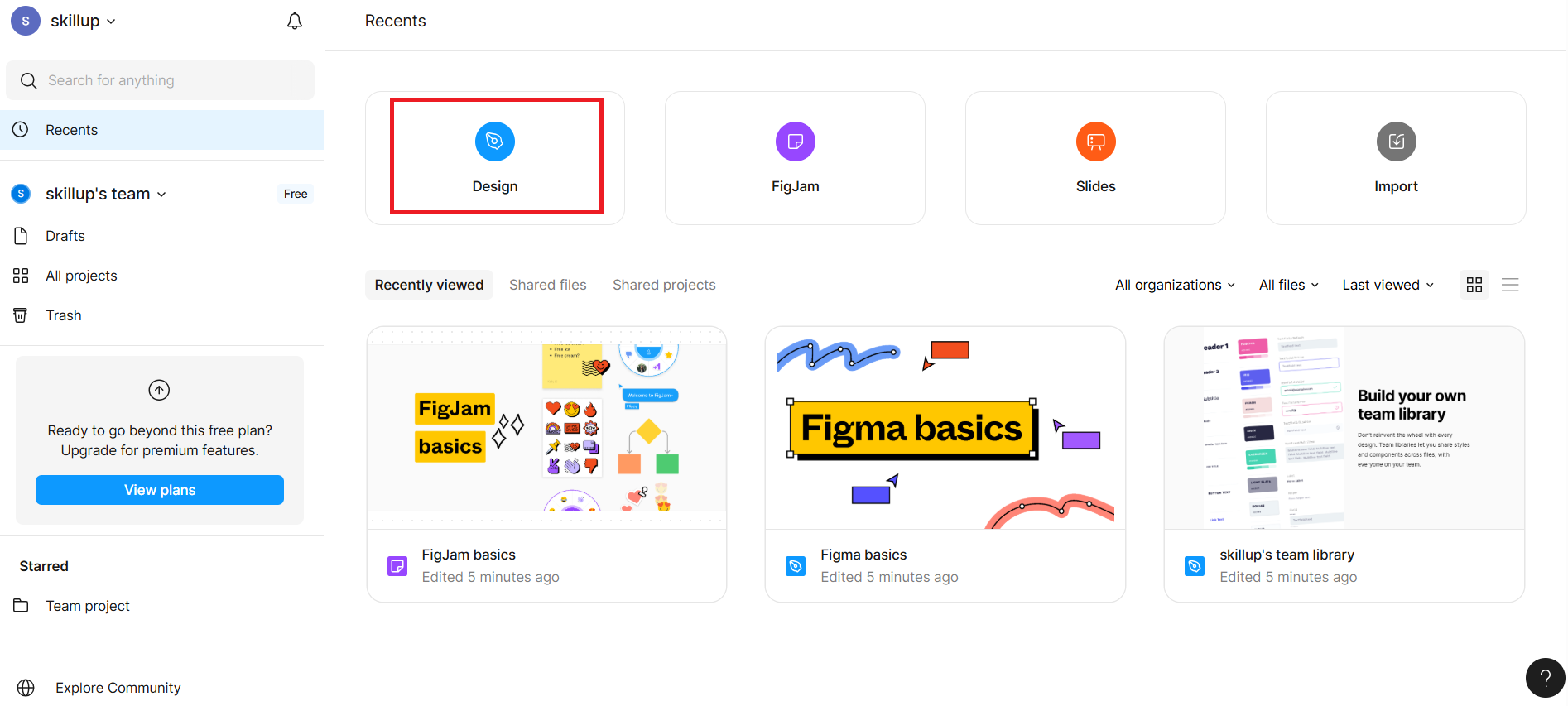
Go to Figma and log in.
After logging in, you will be redirected to your Figma Dashboard. Click the "Design" card visible in the dashboard, as shown in the given screenshot with a highlighted red border.
It opens a blank canvas titled "Untitled."
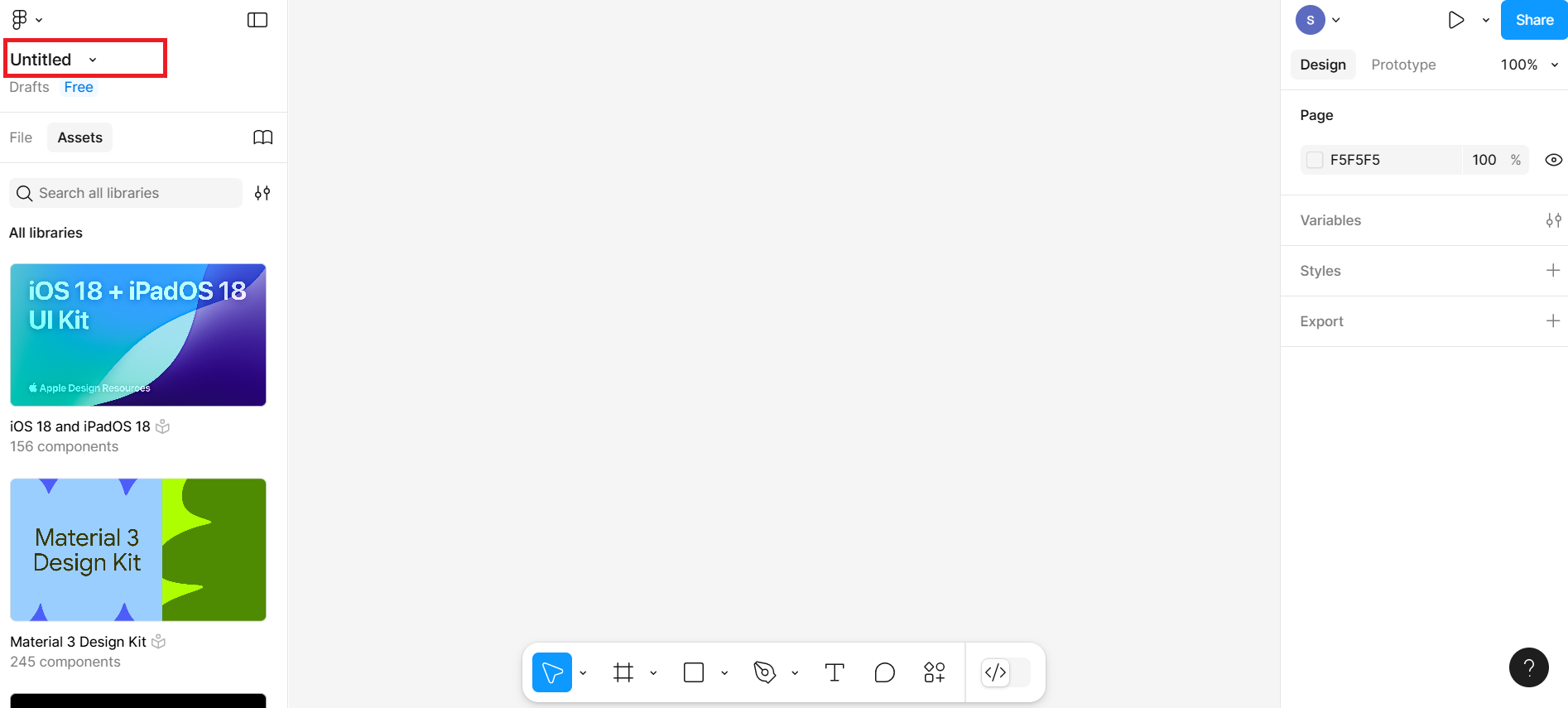
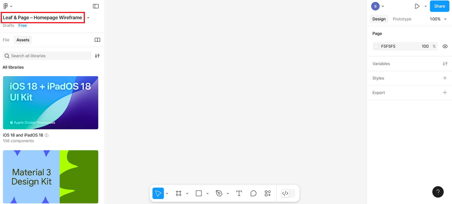
Click the Untitled file name at the top and rename it to Leaf & Page – Homepage Wireframe.
Create the artboard (frame)
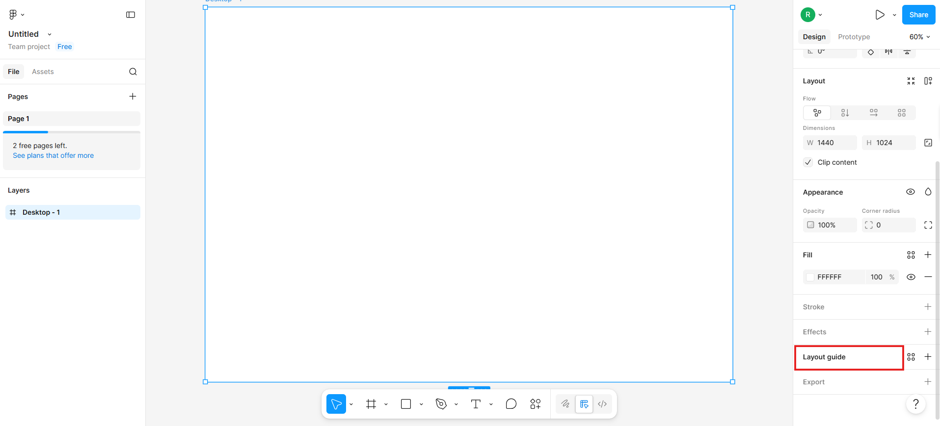
Step 2: Draw the Canvas (frame)
Now select the 'Frame' tool from the bottom toolbar.
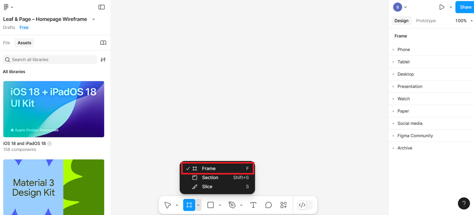
On the right-side panel select Desktop under Frame section to choose a screen size for desktop wireframe.
Add a grid system to the frame
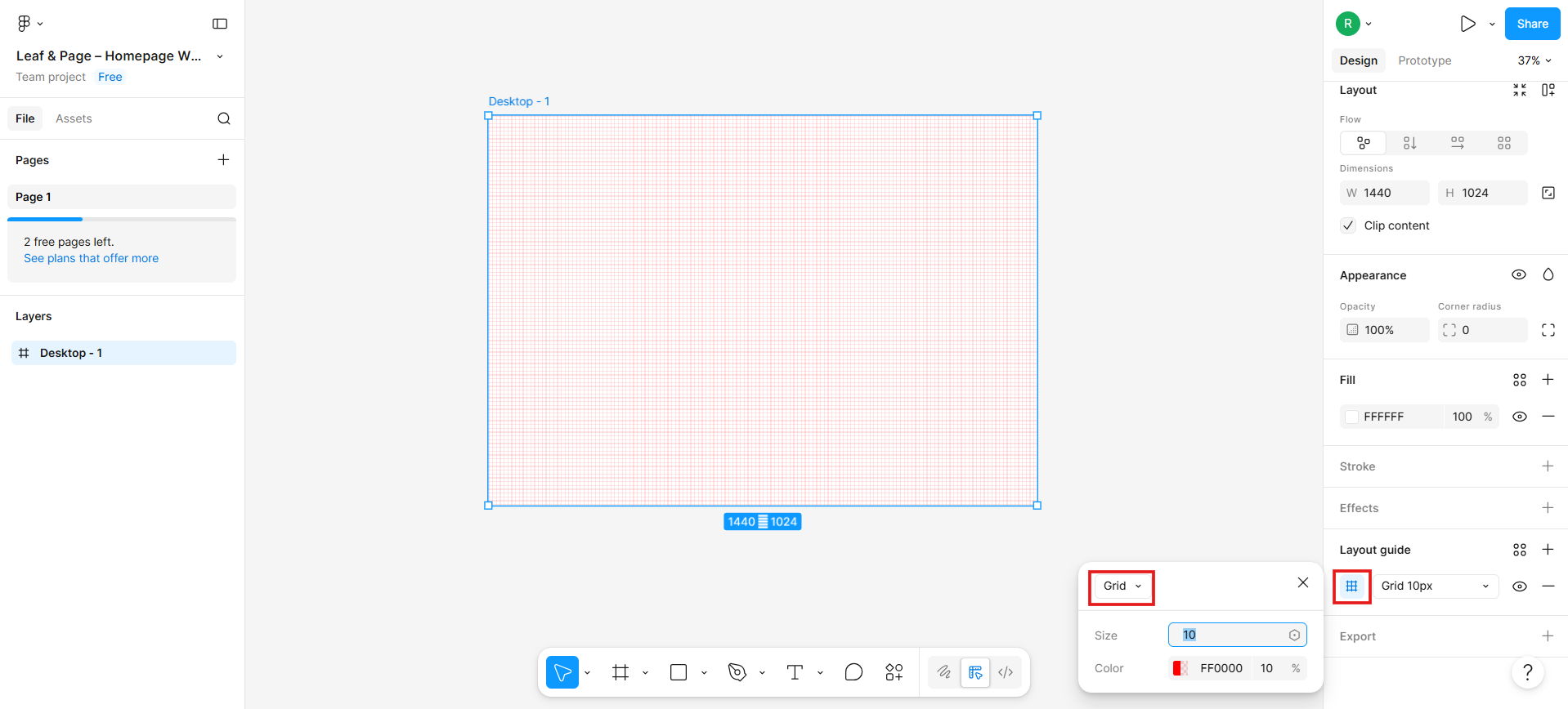
Step 3: Add a column grid
Ensure the canvas frame is selected, then click on Layout Guide in the right-side panel.
After you click the layout guide option, you will see the grid option and the size of the grid in the input box, as shown in the given screenshot.
Then, select the column option from the drop-down menu and give a number of columns as 6, and set the gutter width to 60 pixels to ensure adequate spacing between columns.
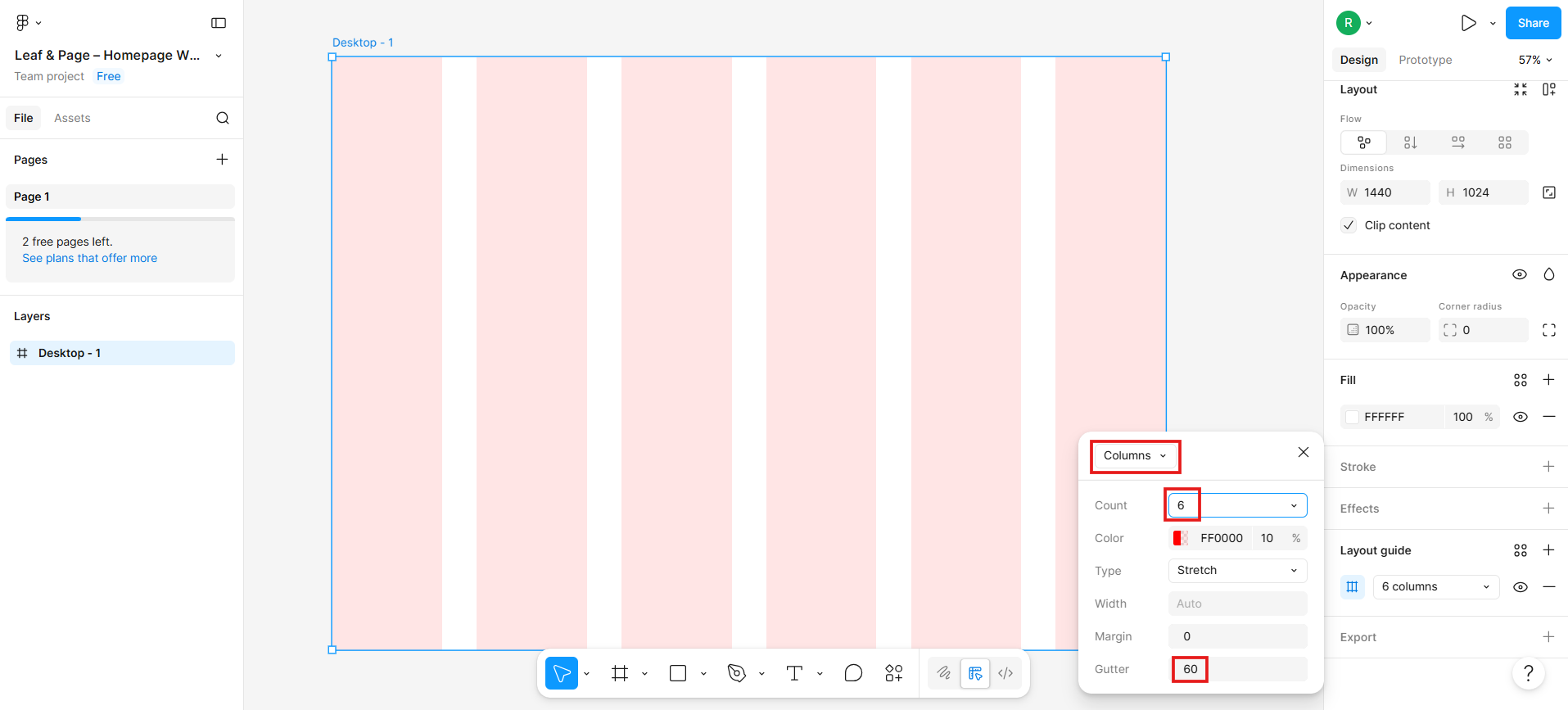
You now have a 6-column responsive grid that spans your frame.
Start wireframing sections
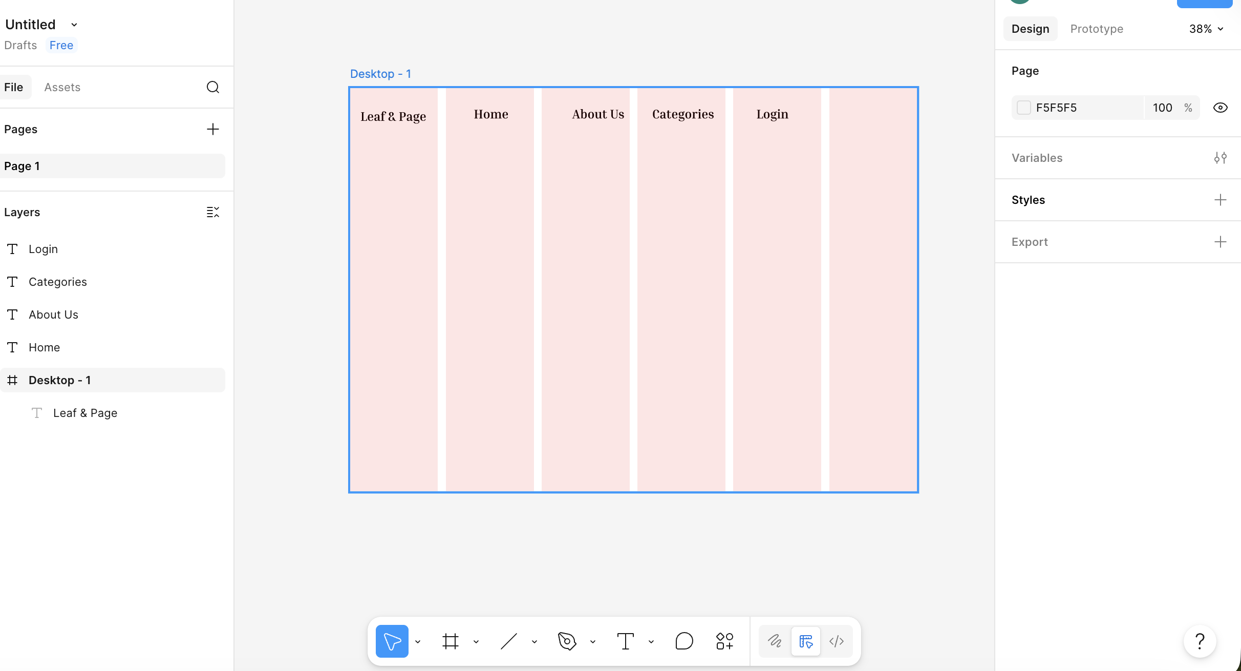
Step 4: Header section You'll now create low-fidelity UI blocks using rectangles, lines, and text.
First, draw a rectangle by clicking on the rectangle option from the bottom menu section.
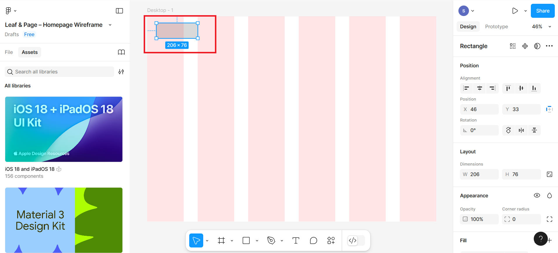
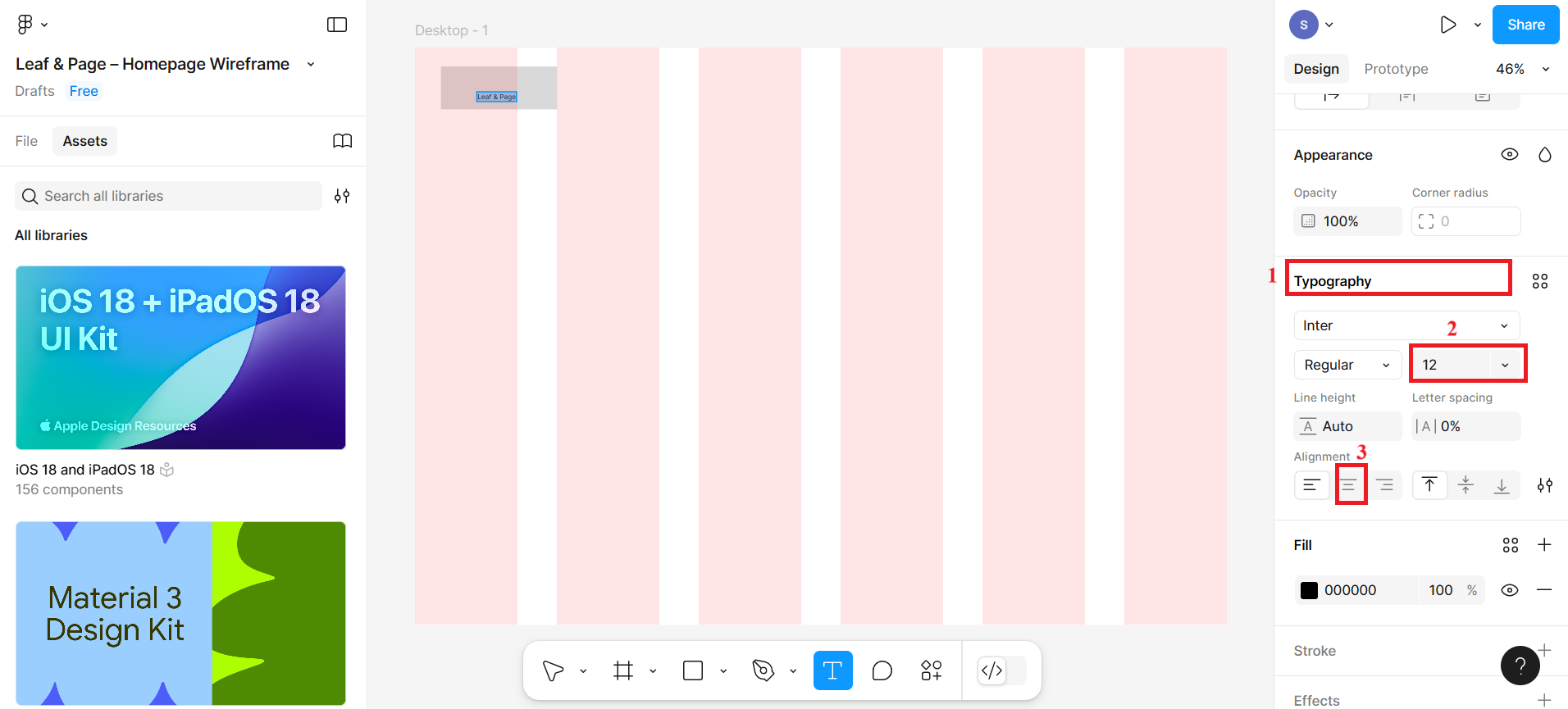
Then, select the T icon to select the textbox and place the text within the rectangle you created. You can write Leaf & Page as text in the rectangle box to represent it as a logo. You can also adjust the size and font family from the typography section on the right side of the bar. (Hint: To get the typography, you need to scroll a little down on the right side.)
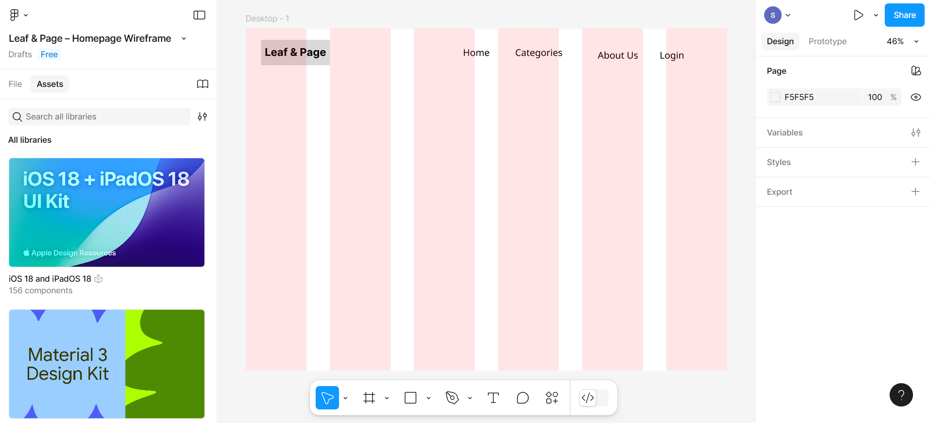
Then, similarly, create more text boxes for header links such as Home, Categories, About Us, and Login without creating rectangle boxes first, and place them in the alignment of the logo you created.
Make sure to align everything using your grid columns. To do that, click and drag any element on the canvas — Figma will display coloured guide lines to help you position it correctly, as shown in the screenshot below.
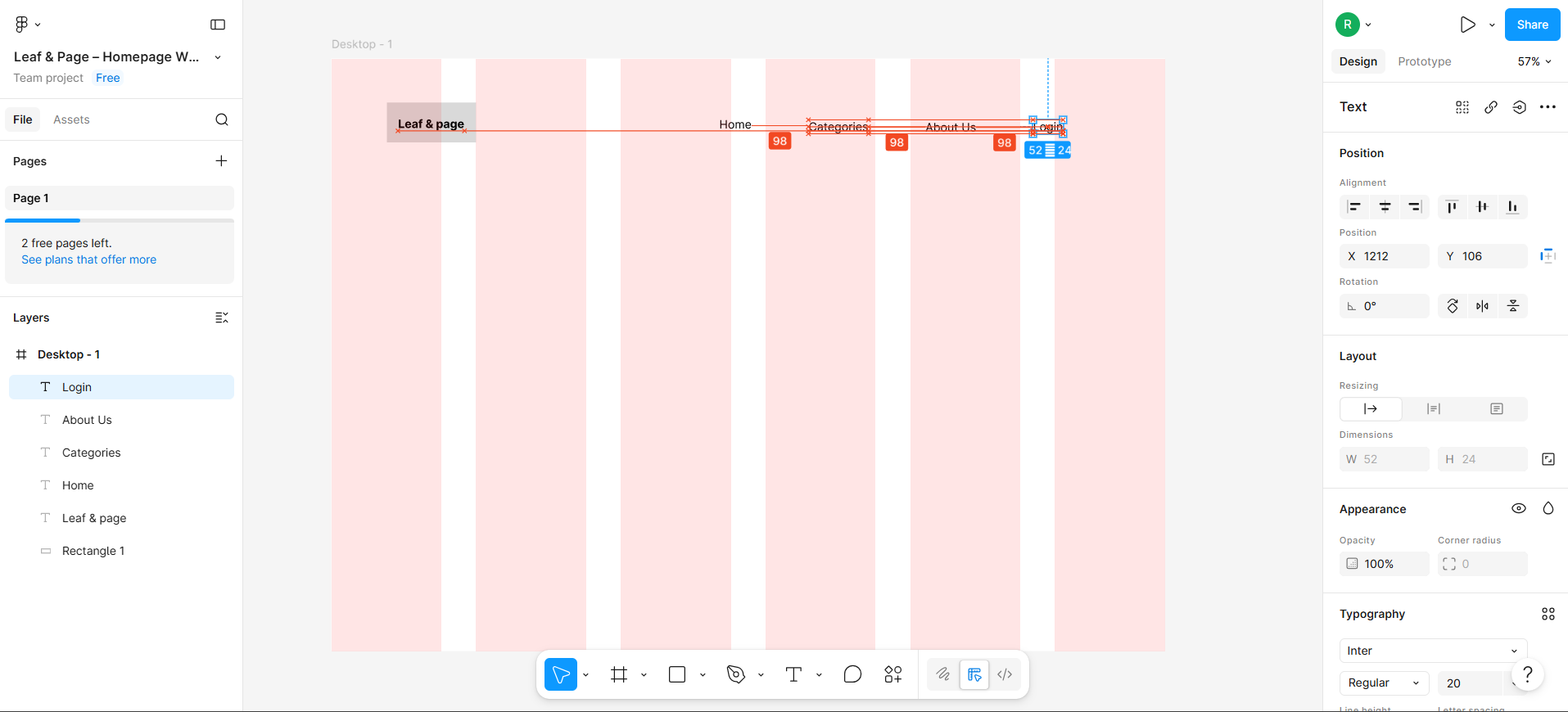
Red lines appear when an element’s edge or centre aligns with another element, confirming they are in line with each other. Blue lines show the boundaries of your currently selected element. Red numbers (e.g. 98) display the pixel distance between elements — when the same number appears between multiple elements, they are equally spaced.
Release the element once you see it is aligned and evenly spaced with the others.
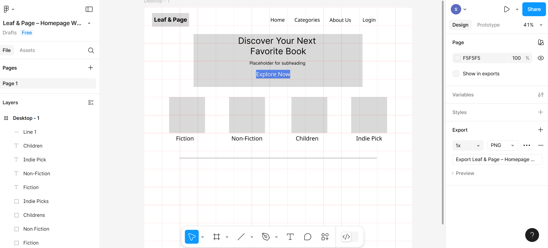
Step 5: Hero section (banner)
Your header section with the 6-column grid active should look like the screenshot below.
Below the header, draw a large horizontal rectangle across the frame.
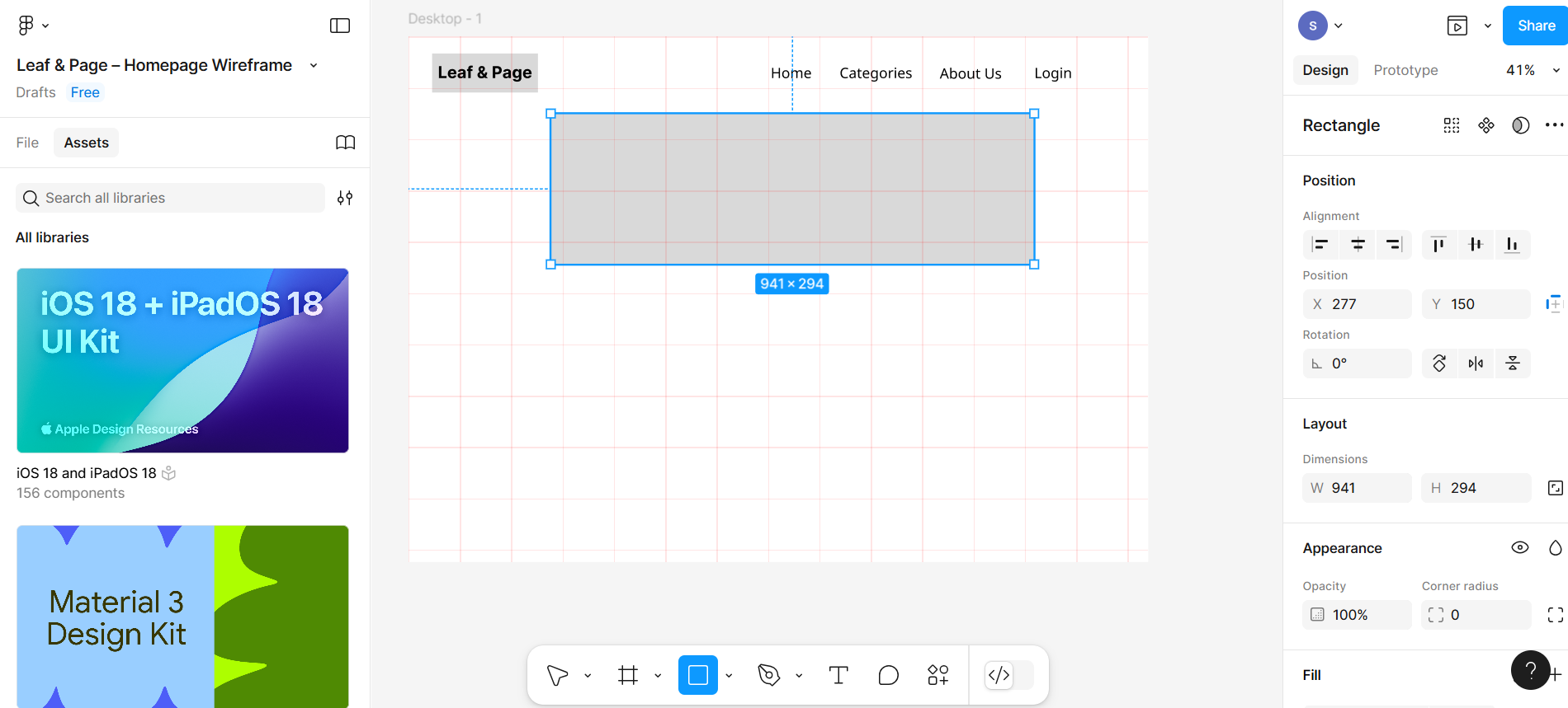
Then, write the text within the rectangle box and change the layout from the typography.
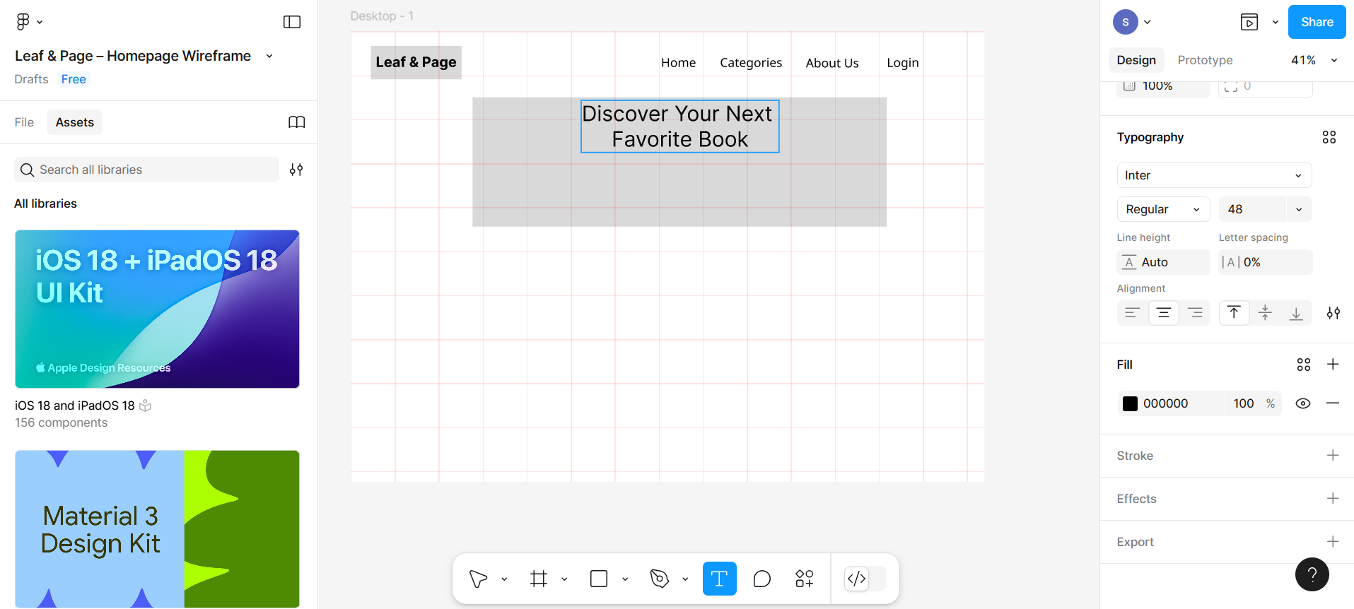
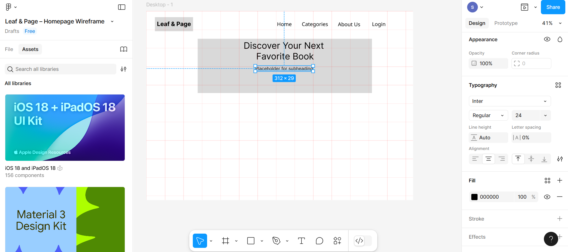
Similarly, create the subheading beneath the main heading and change the layout and font size as well.
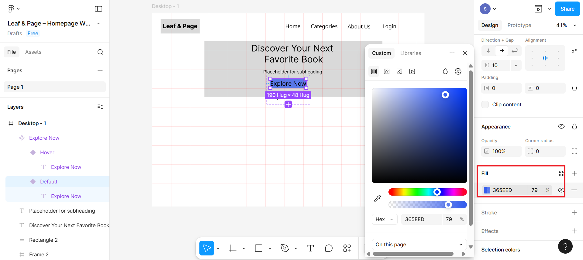
Create one rectangle box for the button and write the text within it as Explore Now.
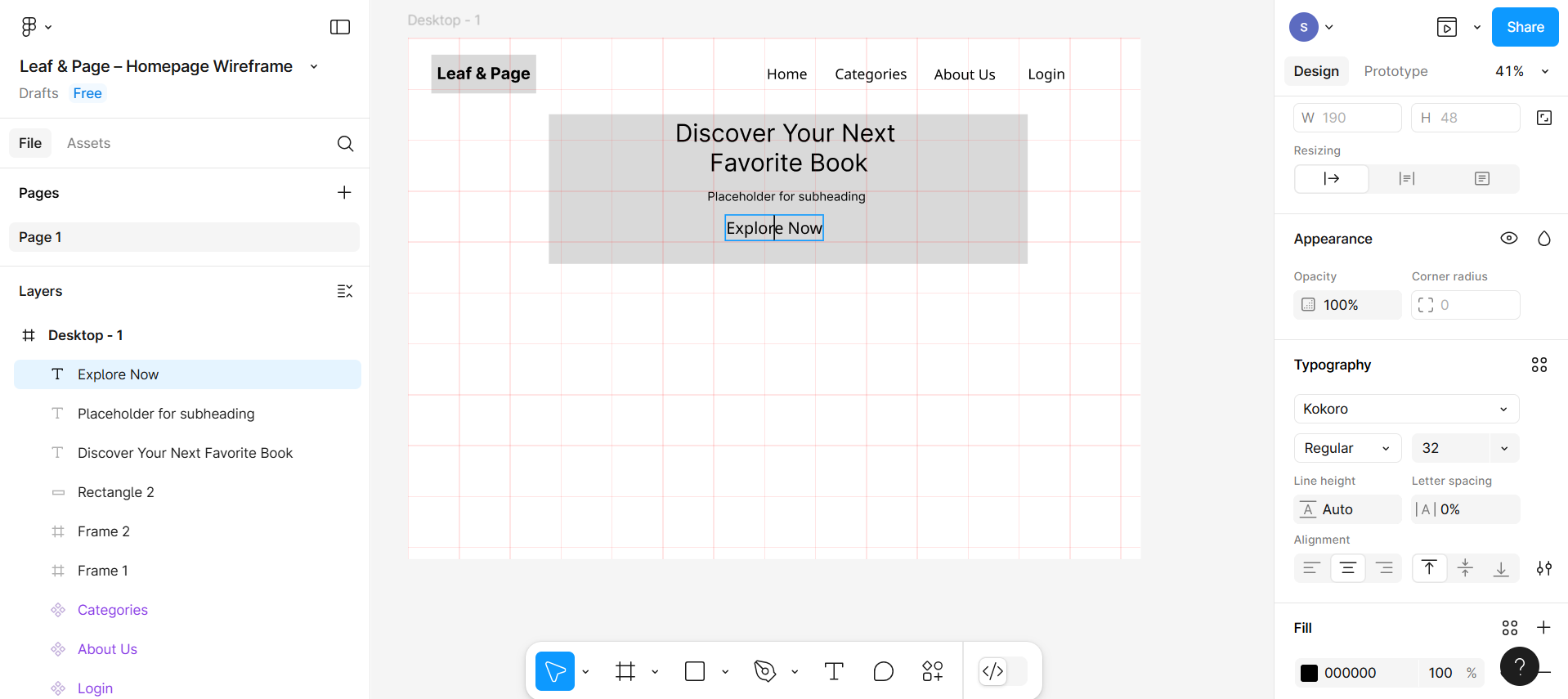
Fill the color in the background of the button by selecting the entire rectangle box and then filling it with color using the layout. You can also change the color of the text by selecting text within the rectangle box and filling it with the text color.
Book categories section
Step 6: Create different book categories
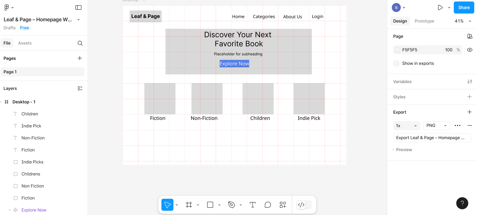
Below the hero section, draw 4 equally-sized boxes side by side using the rectangle and align with the grid.
Now give the text to all the rectangular boxes, as shown in the given screenshot:
Newsletter subscription
Step 7: Create a different subscription section
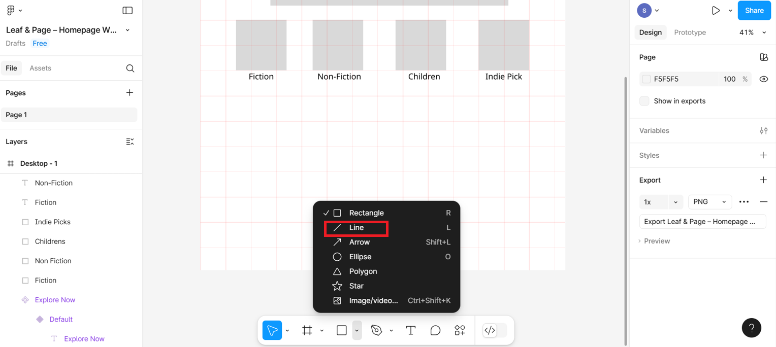
After the book category section, you need to draw a line to separate the subscription category. To access the Line tool, click the rectangle dropdown in the bottom menu bar and select Line from the list.
Then, using a textbox, add a heading Subscribe for weekly recommendations. You can place it in the alignment of the line with the help of the grid section. Using a grid layout, you can easily identify the area where you need to place the text correctly.
Along with this, create one input box using a rectangular box, and also create a button to place it with the input box.
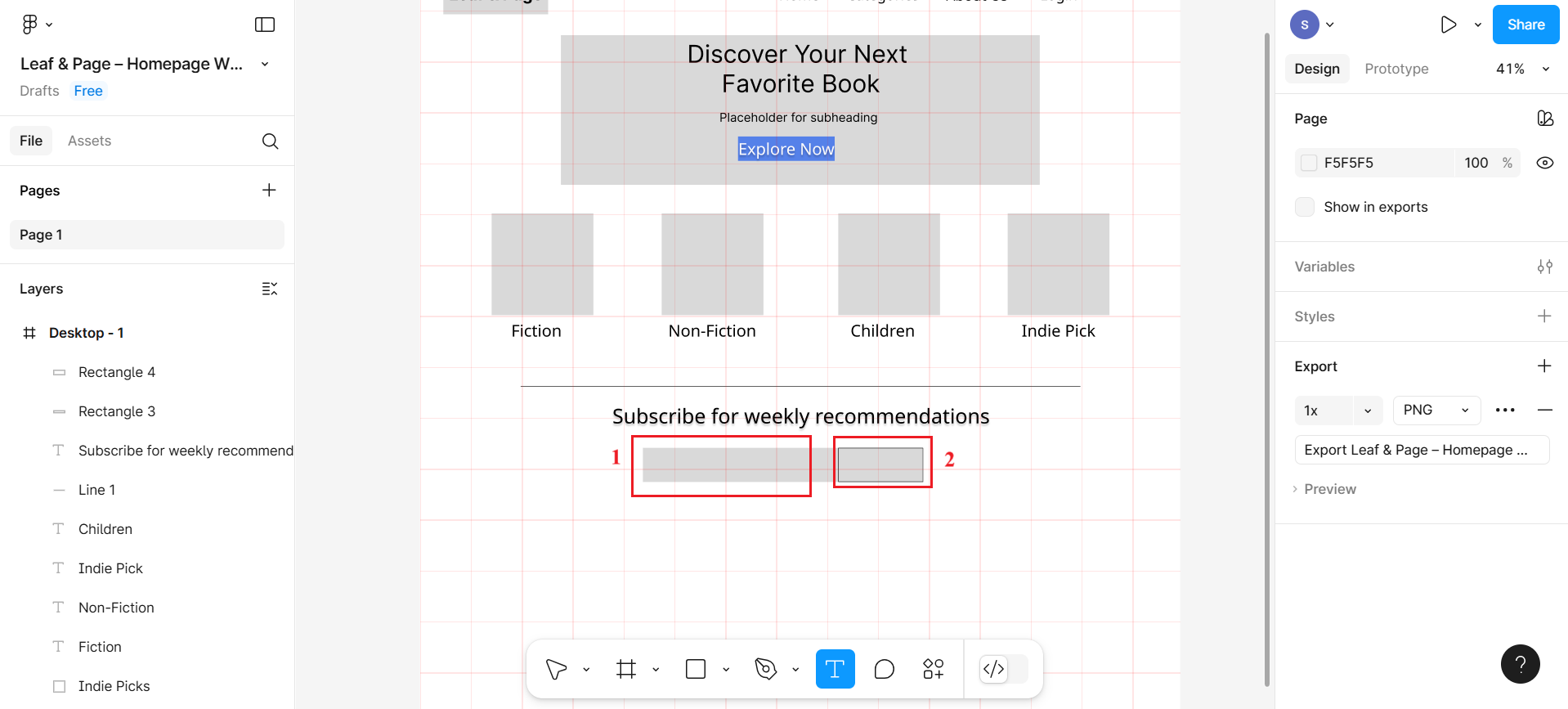
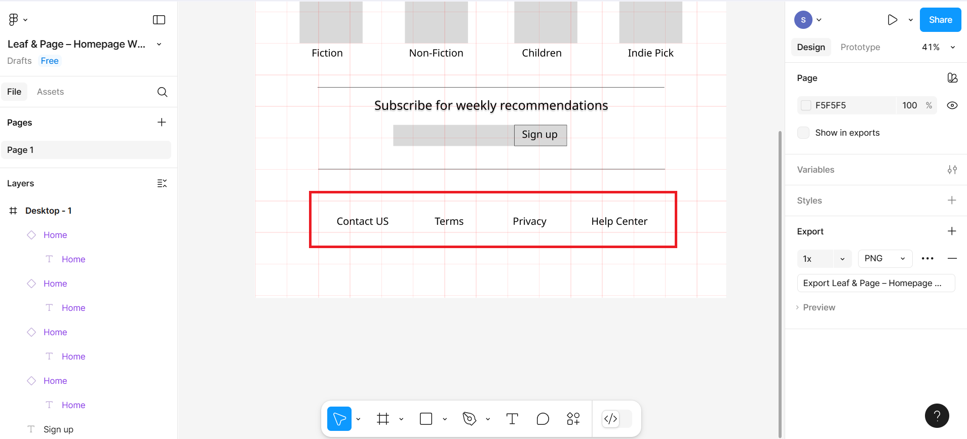
Write text within the button as Sign Up. Also, close the newsletter section using one more line, and then under this section, create a footer section with text labels such as Contact Us, Terms, Privacy, and Help Center.
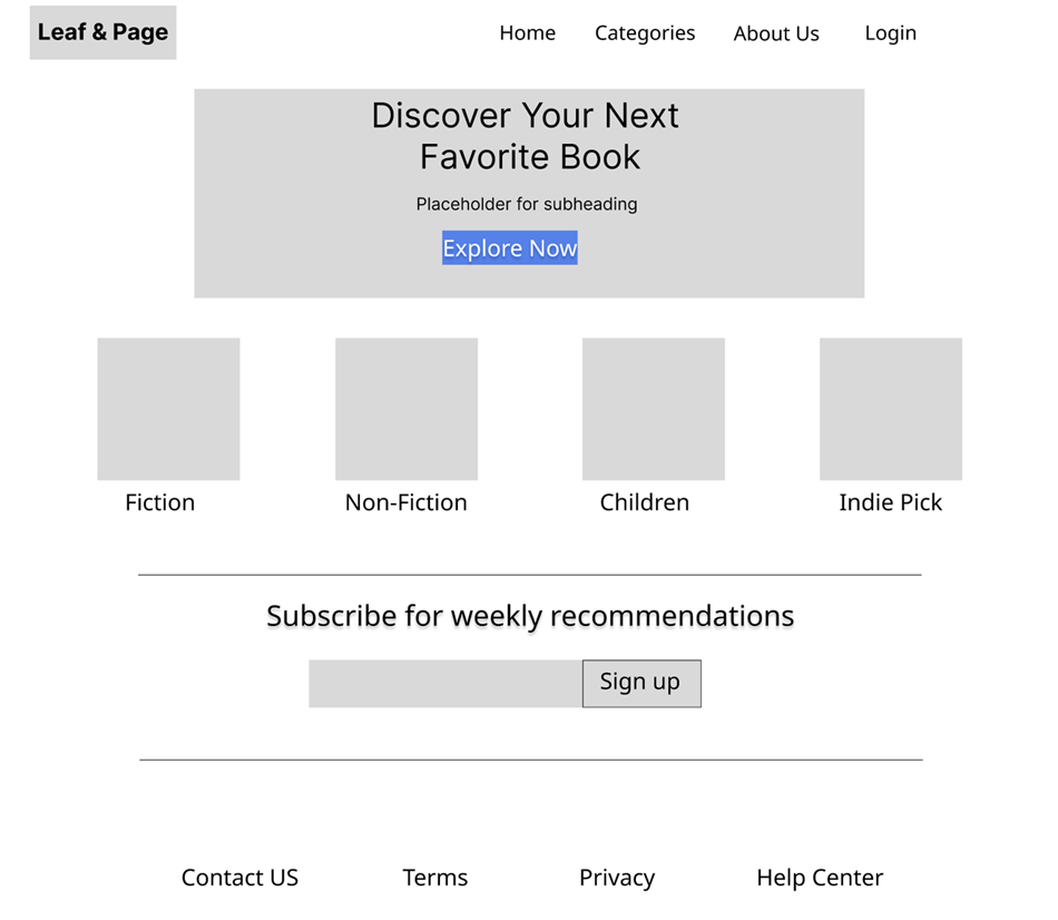
Final design
The final design can be previewed after clicking on the preview button, as shown in the given screenshot:
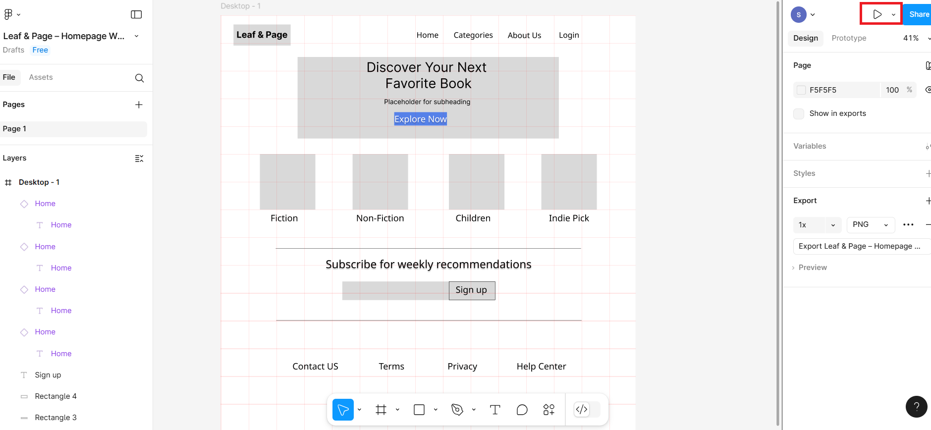
The final look of the Leaf & Page should look like based on given screenshot
Summary
This lab guides you through the step-by-step process of designing a low-fidelity homepage wireframe for a fictional bookstore, Leaf & Page, using Figma. You set up a structured grid layout with defined columns and gutters, and then use basic shapes and text to build key interface sections like the header, hero banner, book categories, newsletter signup, and footer. The exercise emphasizes visual alignment, spacing, and consistency—core principles of UI design—while providing practical exposure to tools like layout grids, typography settings, and component placement in Figma.
Practice Task: ChapterRoot Homepage Wireframe
Create a low-fidelity homepage wireframe for ChapterRoot, a fictional online bookstore. Use simple shapes and text to outline the layout. Focus on clean alignment using a grid—ignore detailed visuals.
What to Do:
- Open Figma and Create a New File
- Rename the file: ChapterRoot – Practice Wireframe
- Draw a Desktop Frame
- Choose a desktop size such as 1440px width
- Apply a 6-Column Grid
- Add a layout grid with 6 columns
- Set gutter spacing, such as 60px, for consistent alignment
Sections to Include:
- Header
- Add a rectangle for the logo labeled: ChapterRoot
- Add text links: Home, Books, About, Login
- Hero Section (Banner)
- Large rectangle across the top
- Add a heading: Discover Your Next Favorite Book
- Subheading below: Hand-picked selections for curious readers
- Rectangle button: Browse Now
- Book Categories
- Create 4 side-by-side boxes
- Label each with categories like: Fiction, Non-Fiction, Children, Best Sellers
- Newsletter Signup
- Add a line to separate the section
- Heading: Join our mailing list
- Add an input box and a Subscribe button
- Footer
- Add footer text: Contact, Privacy Policy, Help Center
Author(s)
Richa Arora