
Lab: Building a Color and Typography System
Estimated time: 30 minutes
What you will learn
In this lab, you will learn how to build a reusable color palette and typography system in Figma, essential components of any professional user interface design. By creating these foundational styles, you will ensure visual consistency, maintain brand identity, and speed up your design process. You will explore how to define and apply primary, secondary, accent, and neutral colors, and save them as color styles. Similarly, you will structure heading, body, and caption text using clear font choices and hierarchy. These styles will later help you design UI components like buttons, cards, and pages with efficiency and clarity.
Learning objectives
By the end of this lab, you will be able to:
Create a custom color palette in Figma
Save and reuse color styles for consistent visual language
Build a structured typography system with defined heading, body, and caption text styles
Explain the importance of reusable design tokens (styles) in UI/UX projects
Prerequisites
- Basic familiarity with the Figma interface
- Understanding of what fonts and colors mean in user interface design (basic theory)
Note: If this is your first time using Figma, we recommend creating an account. To do this, right-click on Getting Started with Figma and open it in a new tab to sign up.
Introduction
Before jumping into designing full interfaces, UX/UI designers first create design systems that include standardized color palettes and typography styles. This foundational work ensures that the user interface remains visually consistent and brand-aligned across all screens and components. In this lab, you'll take the first steps in that process by setting up a color system with primary, secondary, and accent tones, as well as text styles for headings, paragraphs, and captions. Using Figma's style features, you'll learn how to convert manual design choices into scalable design tokens you can reuse across your future projects. This lab will serve as the base for the next session on testing for accessibility and readability.
Design Scenario
Imagine you've been hired as a UI/UX designer to create a promo card, at a startup called Fresh Basket, an online organic grocery delivery service. The company is focused on promoting healthy eating, eco-friendly sourcing, and a user-friendly digital experience. The colors should reflect freshness, nature, and trust—like greens, browns, and a bright accent for buttons. Typography must be clean, readable, and well-structured for headings, body text, and labels. This system will be reused across app screens, banners, and promo cards. Your work will ensure visual consistency and reflect the brand's values.
Getting started
This lab consists of three parts. First part will setup your design file in Figma, second part will help you in creating a Color Palette and third part will setup Typography Styles.
Note: The color palettes and typography styles created in this lab will support you in developing the design layout more effectively
Part 1: Setup Figma design file
Step 1: Open Figma and create a new file
Go to https://figma.com and log in.
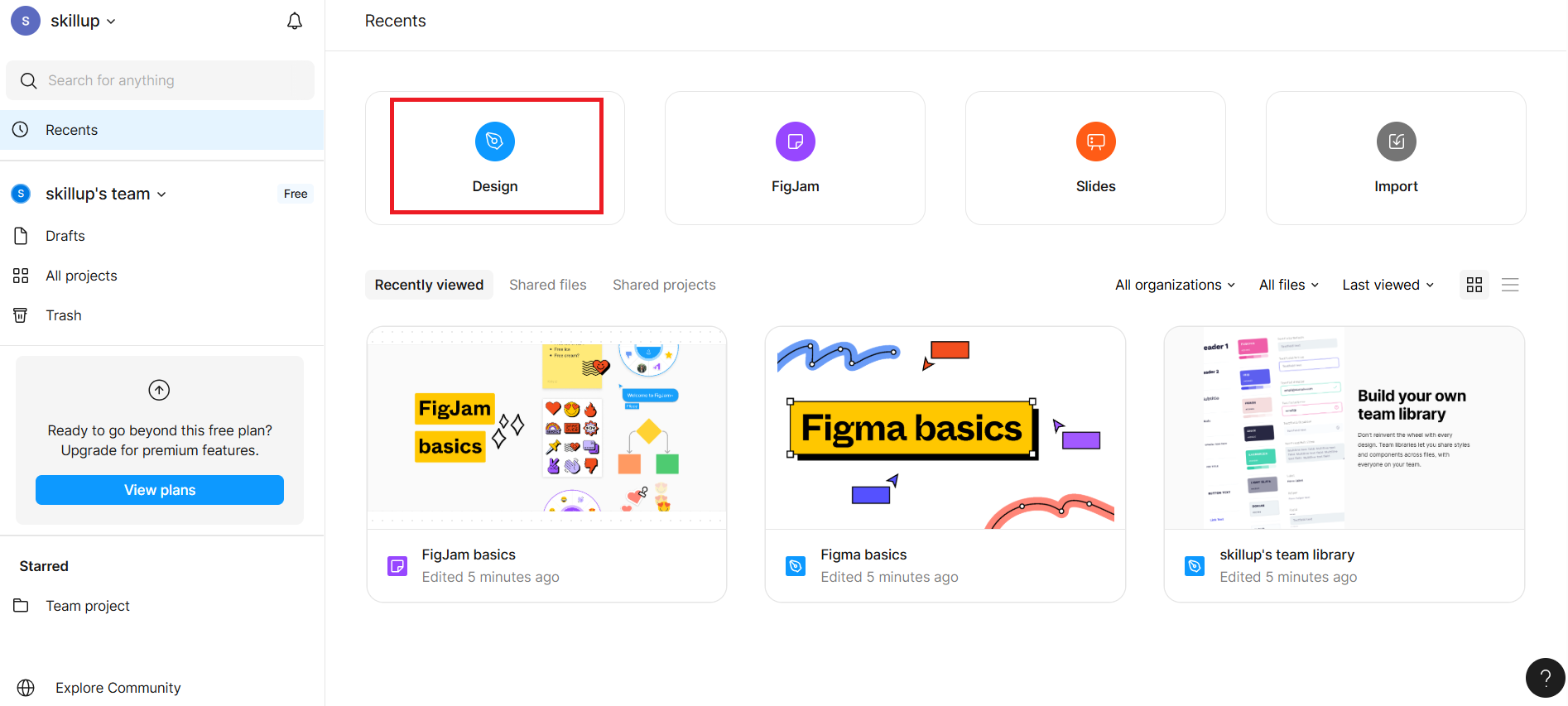
After logging in, you will be redirected to your Figma Dashboard, click the "Design" card visible in the dashboard as shown in the given screenshot with a highlighted red border.
It opens a blank canvas titled "Untitled".
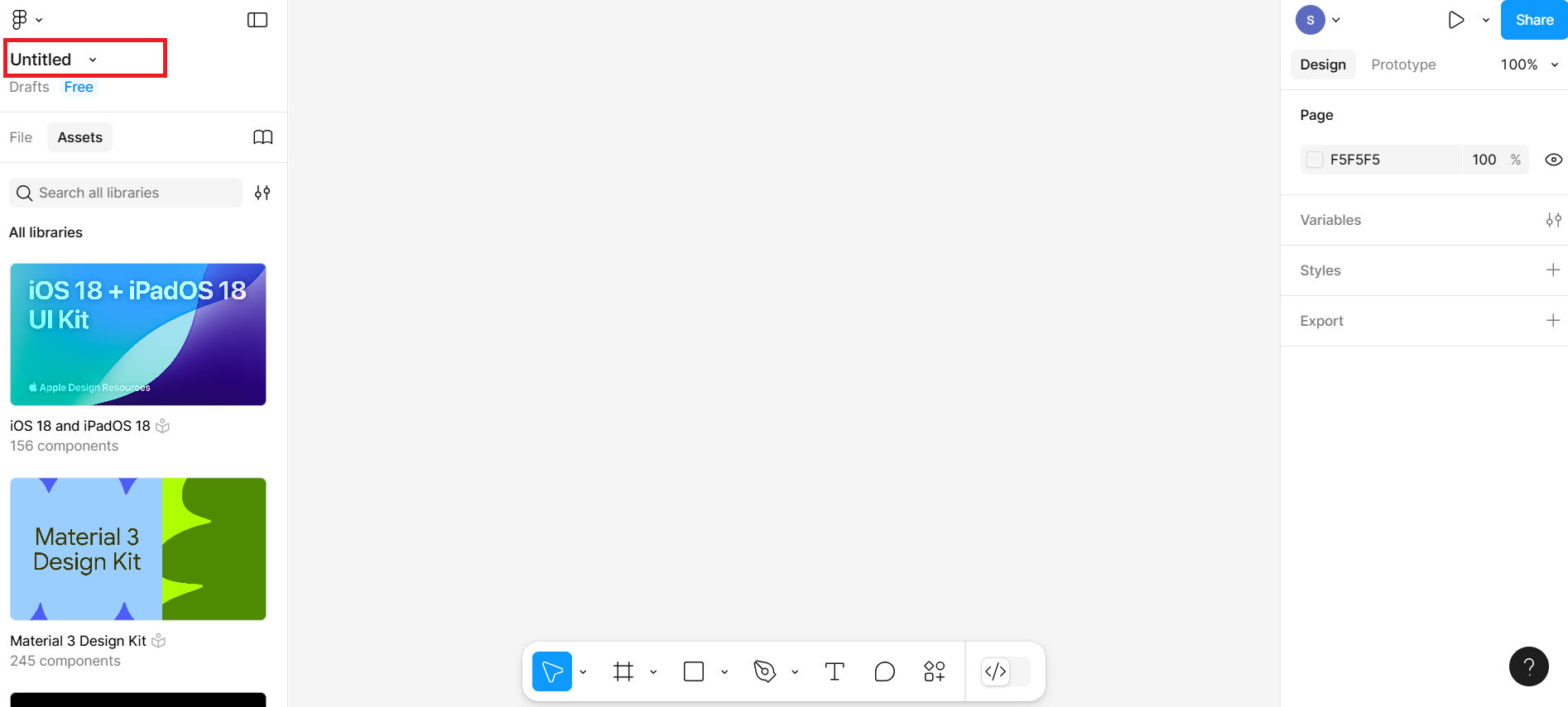
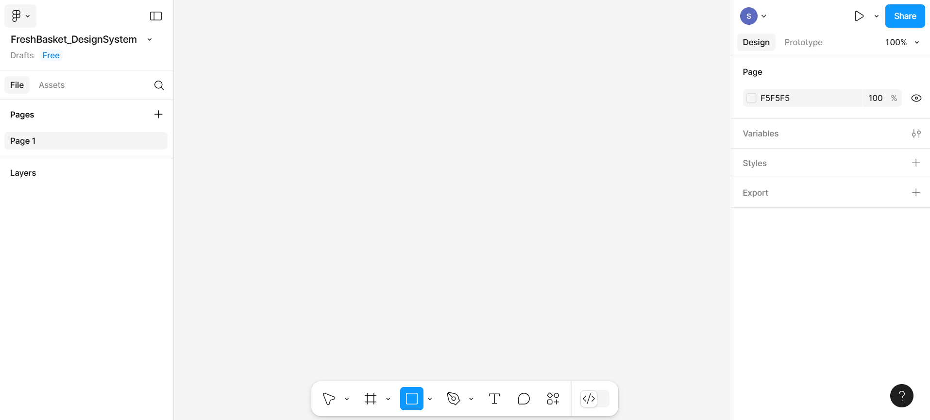
Click on the Untitled file name at the top and rename it to FreshBasket_DesignSystem
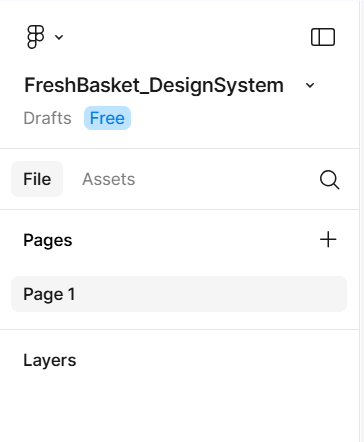
The entire Figma design setup will look similar to the given screenshot.
Part 2: Creating a color palette in Figma
A color palette is a set of color samples you will use throughout your designs to maintain consistency and visual identity. Each color is added as a style so it can be reused easily.
Step 1: Create color swatches
Here, you will create a color palette for the brand promo card.
Select the rectangle box from the bottom menu bar. Click and drag your mouse on the canvas to draw a square shape. Set its size to approximately 50 pixels by 50 pixels — this will be your first color swatch. On the right-hand sidebar, you'll see a section called "Fill". This is where the color of the shape is defined.
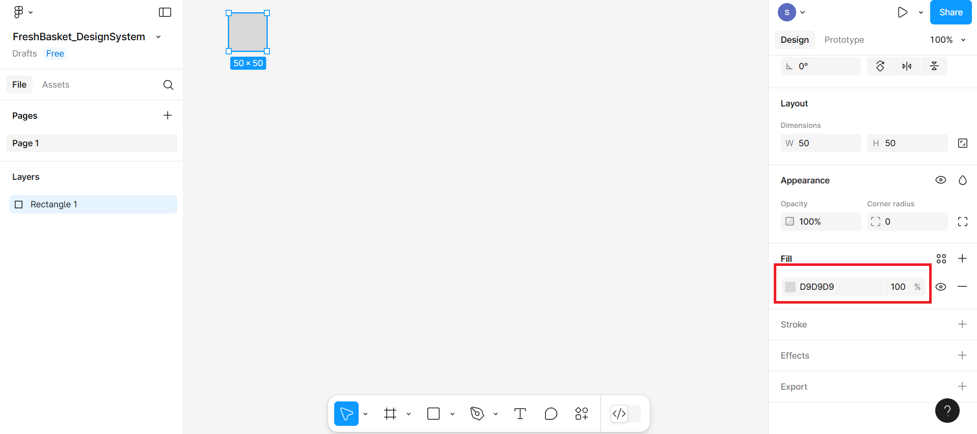
Click on the fill option in the right-hand sidebar. A color picker will pop up. Here, you can manually pick a color or paste a hex color code in the input box. Include the color 4CAF50 for the Hex value. This will give you the color for the fresh green.
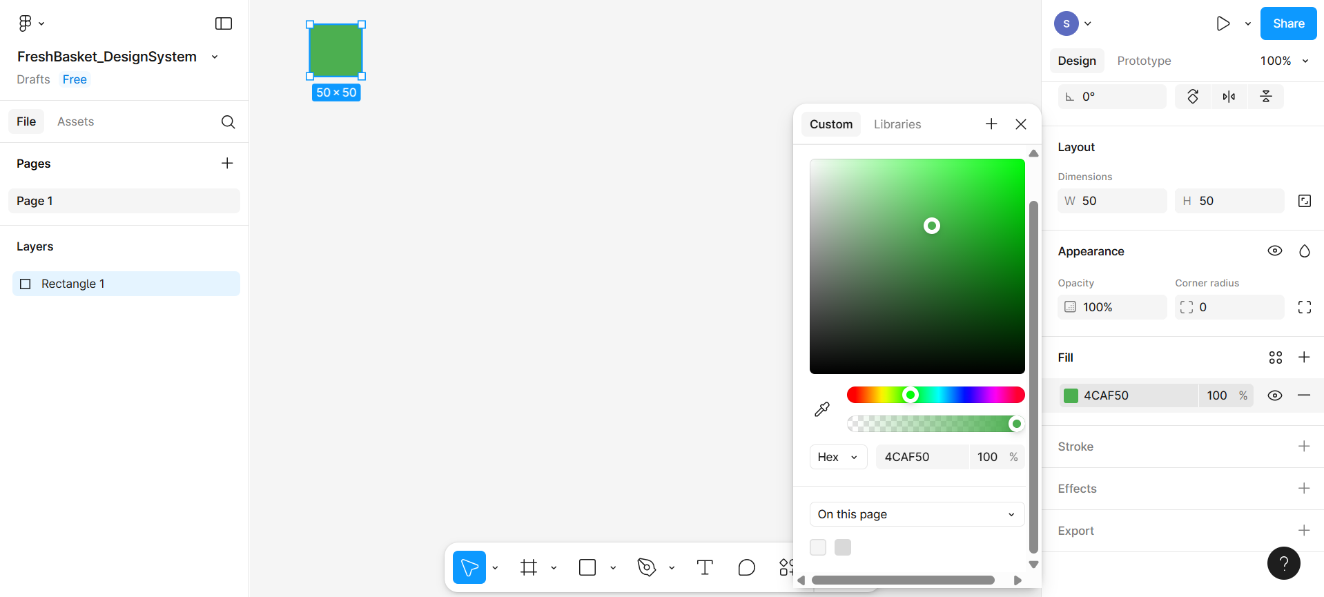
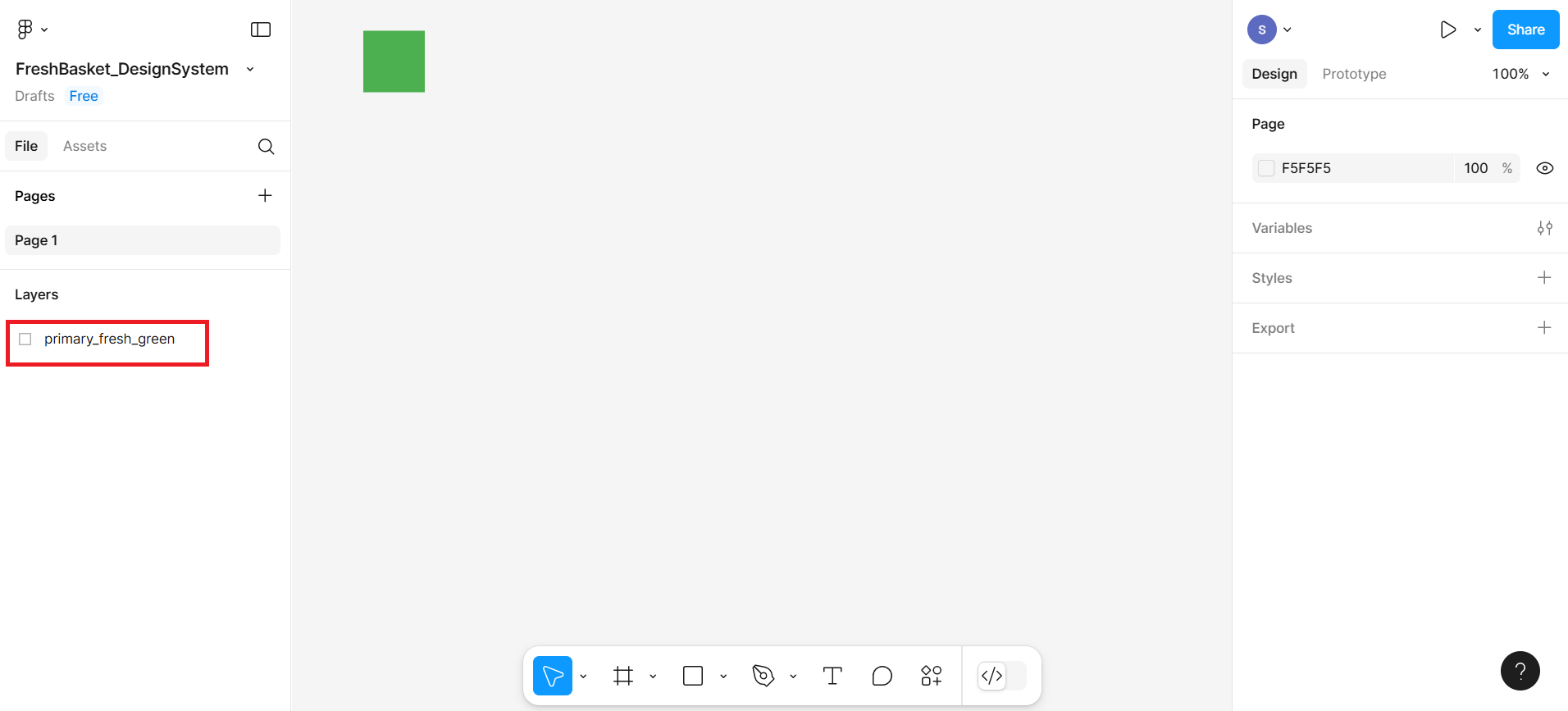
You can also change the name of this rectangular box in the left-hand sidebar. You can give the name primary_fresh_green.
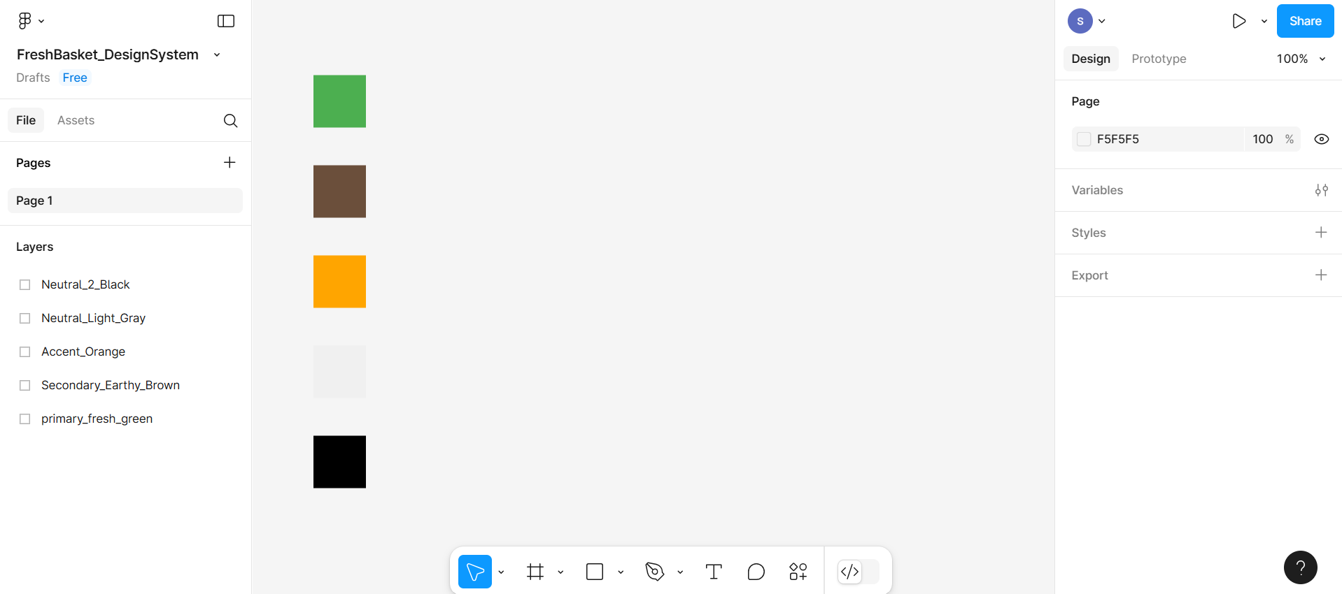
Similarly, create more variants of this rectangle box for the given colors:
- Secondary Color (Earthy Brown): #6B4F3B
- Accent Color (Orange for buttons/CTAs): #FFA500
- Neutral Color 1 (Light Gray): #F0F0F0
- Neutral Color 2 (Black): #000000
Now you should have 5 small color squares on your canvas, each filled with a different color. You can also change the name of newly created rectangular boxes.
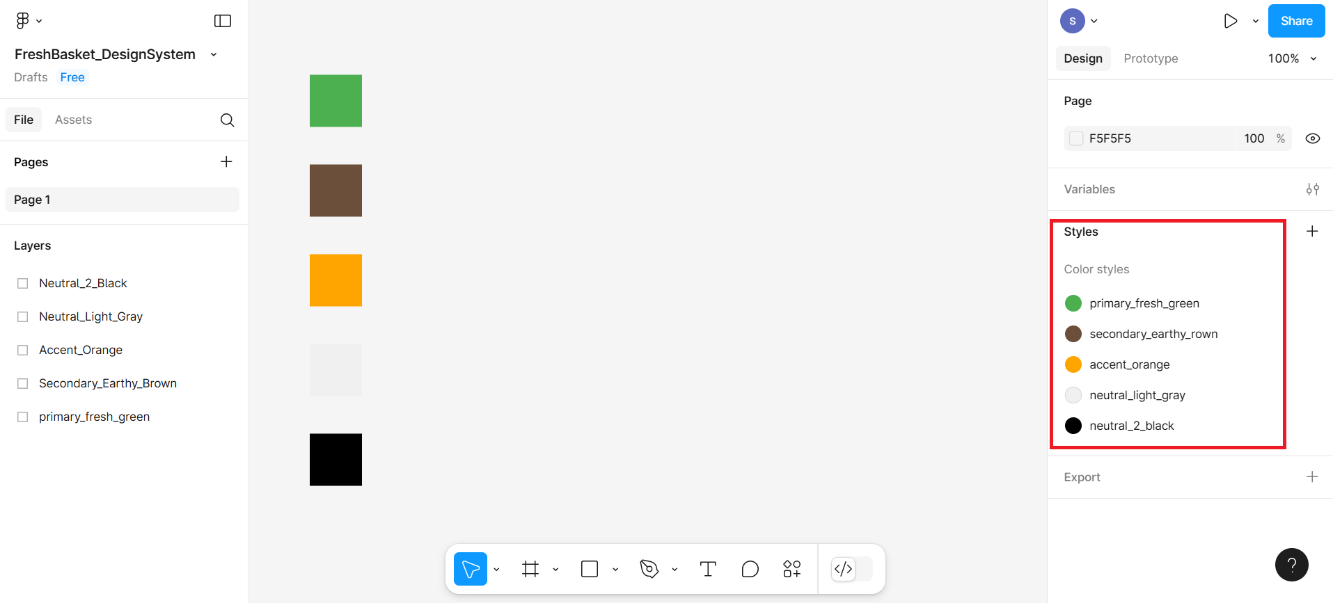
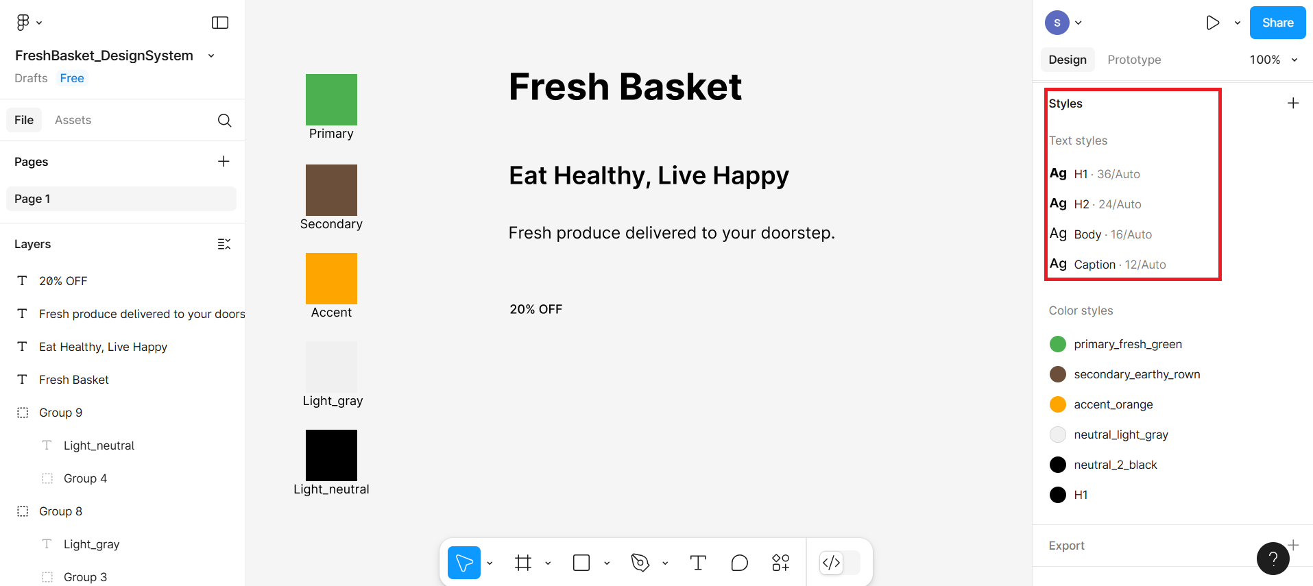
Step 2: Save colors as reusable styles
Select a Swatch (Rectangle).
First, make sure you have drawn your color swatches using the Rectangle Tool.
Each swatch should be filled with a different color, such as Fresh Green, Earthy Brown, Orange, etc.
Click to select one rectangle (swatch) at a time.
Open the Fill Settings.
On the right-hand sidebar, look for the section labeled "Fill".
You'll see a small color preview box (showing your current fill color).
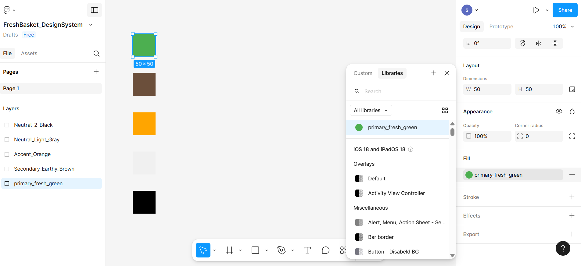
Just next to that color box, there's an icon with four dots (••••). This represents the Style menu for fill colors.
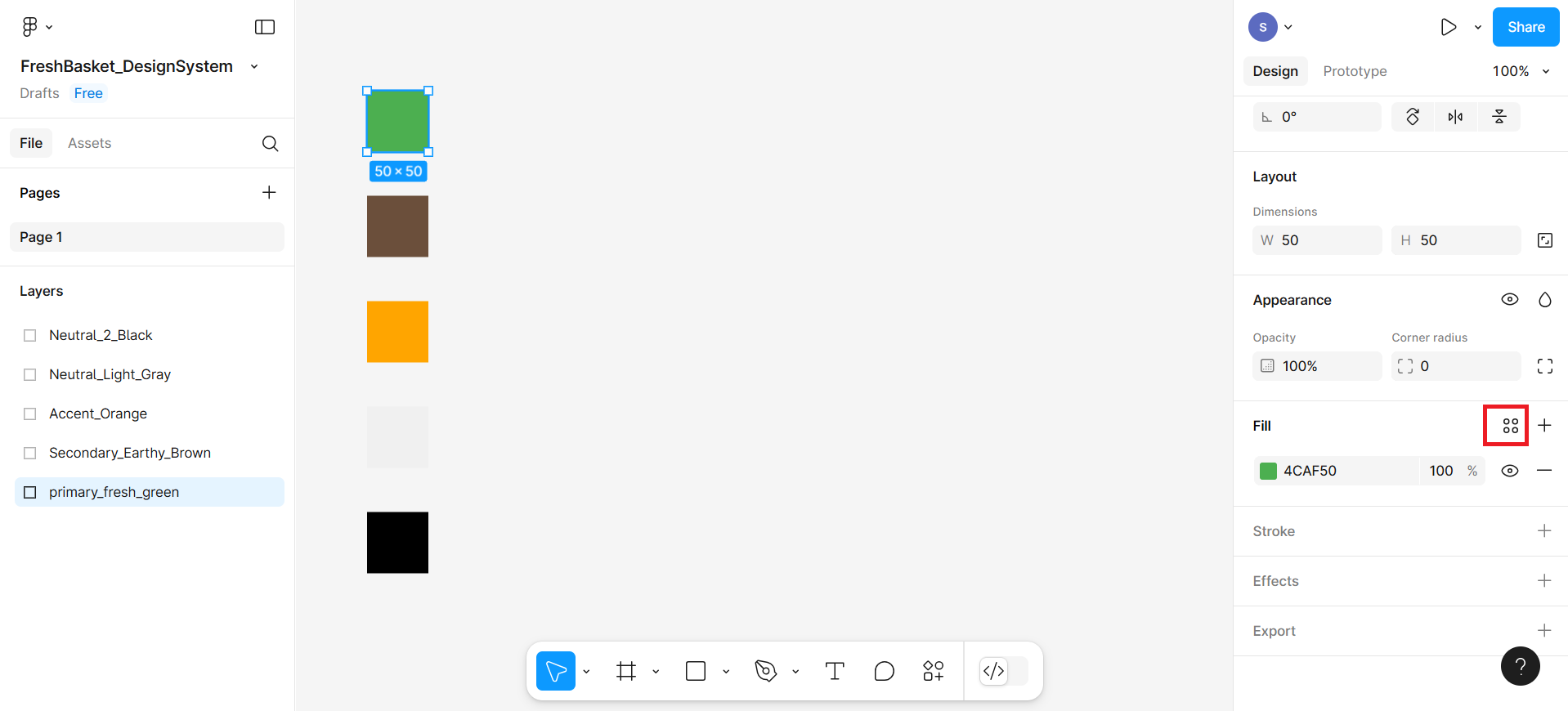
Click this icon to open the style panel. A pop-up box will appear.
Once the style panel opens, you'll see any existing styles (if any) and a "+" (plus) button.
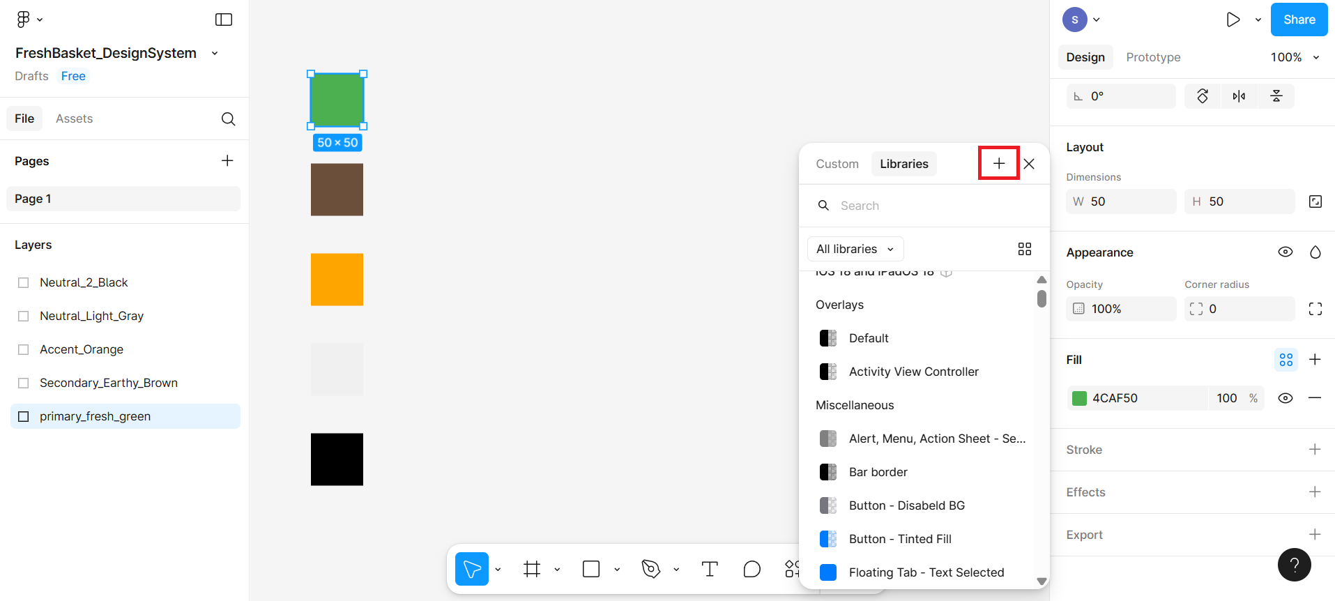
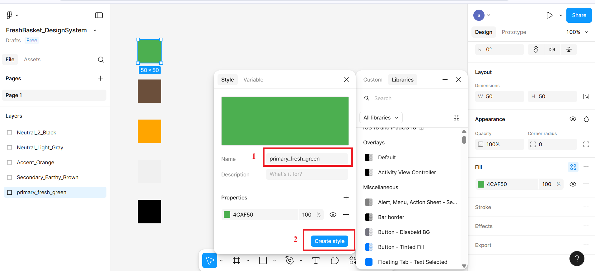
Name the color style properly
A pop-up will appear asking you to name your new style.
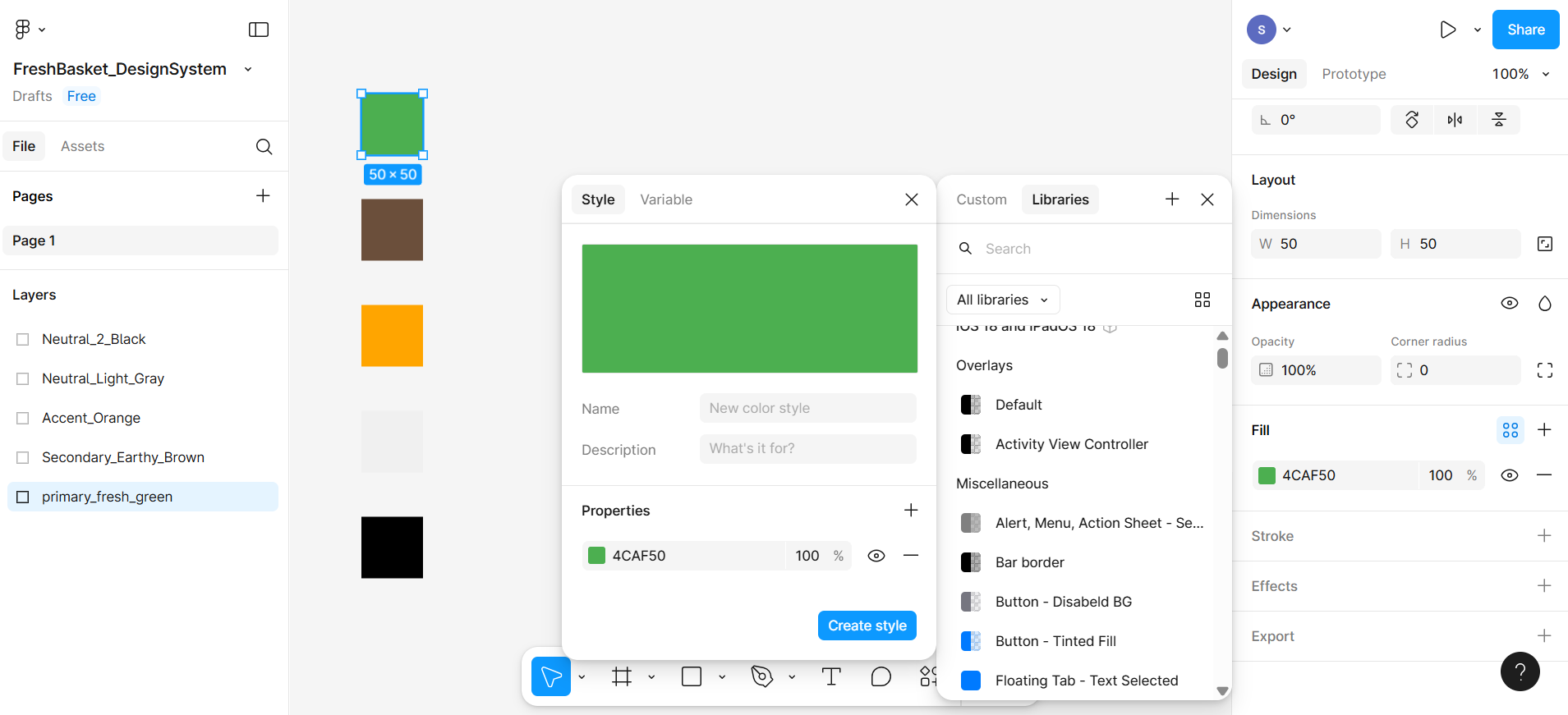
Use clear and consistent naming as shown at number 1 in the given screenshot. Then click on the Create style button highlighted in the red box at number 2.
After clicking on the button, it will include this color in the libraries shown in the given screenshot.
Repeat for All Swatches
Repeat steps 1 to 4 for each of your remaining color swatches.
Make sure each color is selected, and a matching style is created and named accordingly.
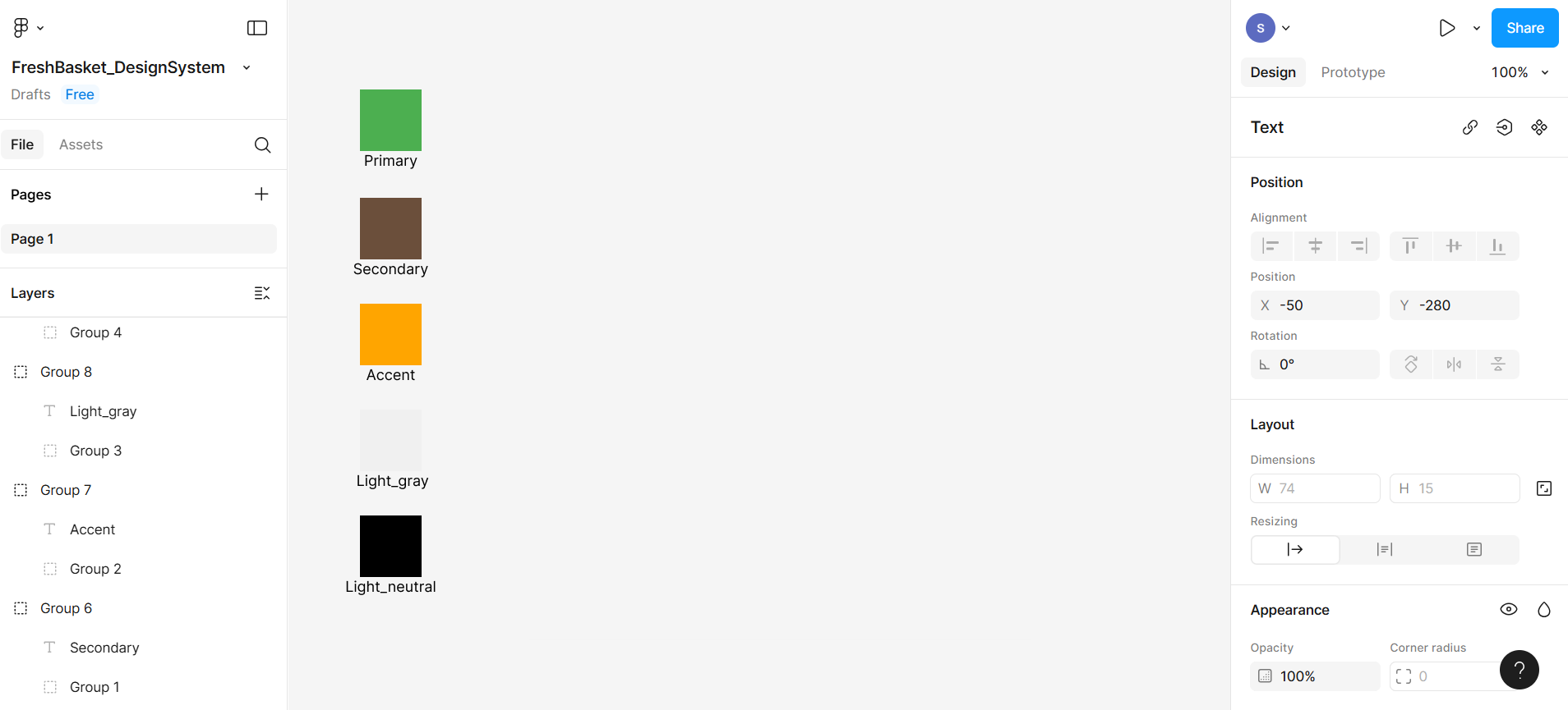
Step 3: Label your color swatches
Select T on the bottom menu bar to activate the Text Tool as shown at number 1 in the given screenshot, and then write Primary below the first rectangular box as shown in the given screenshot at number 2.
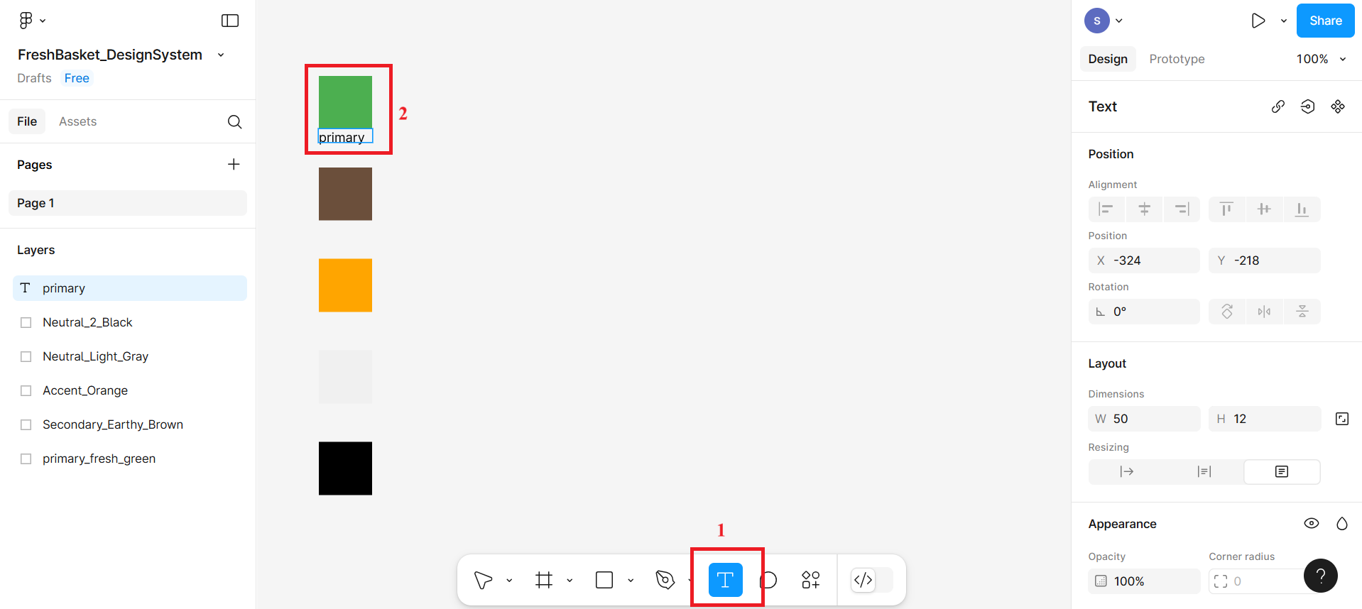
Adjust the size and position of the text so it appears clearly under each swatch.
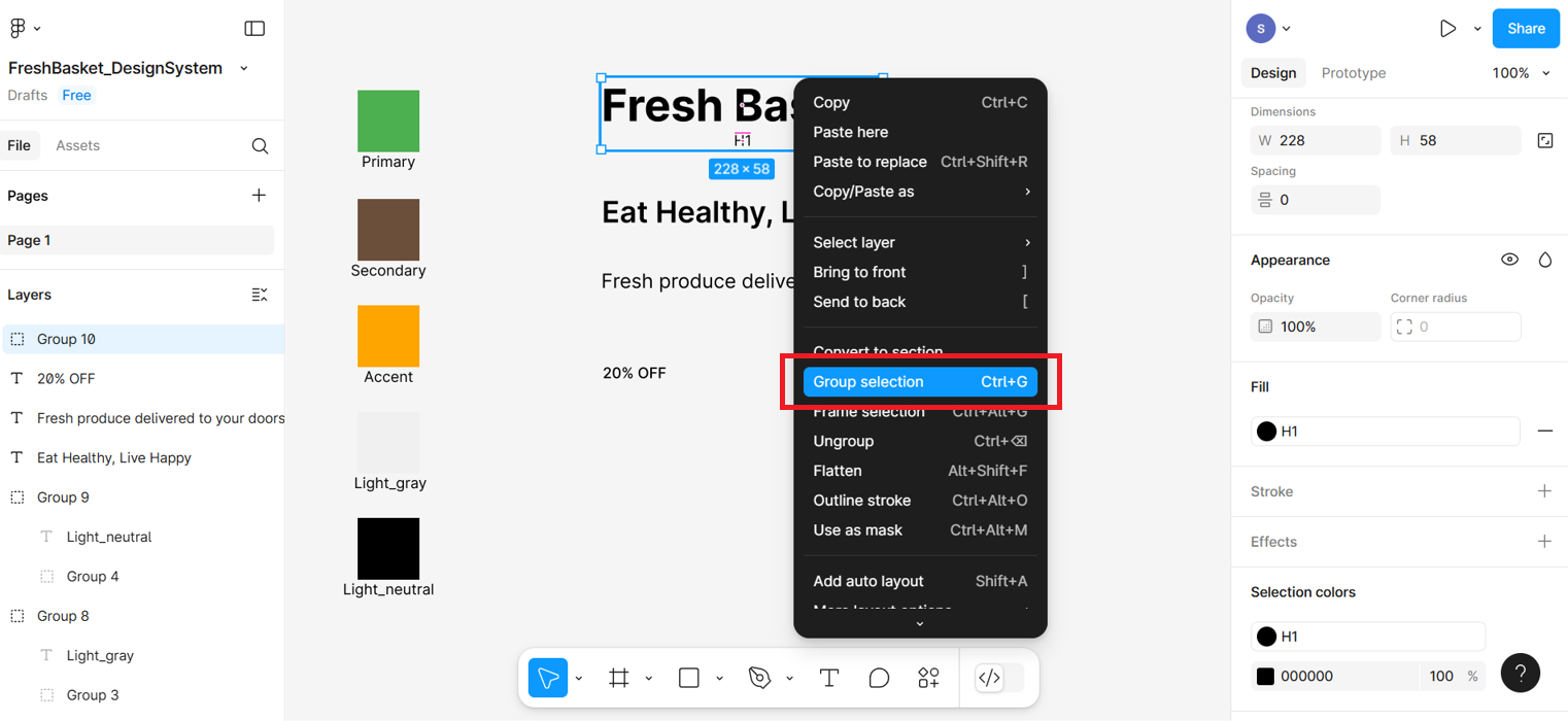
To keep things organized, select the rectangle and its label (press the shift key and then select both), right-click, and select Group Selection. This groups the color and its label together so they move as one unit.
Part 3: Creating typography styles
Typography styles help keep your text consistent across your app or website. You'll create styles like headings, body text, and captions that match your brand.
Step 1: Add text elements
Press T on your keyboard to activate the Text Tool (or click the "T" icon in the top toolbar). Then click anywhere on the canvas and type your first line of text: Fresh Basket
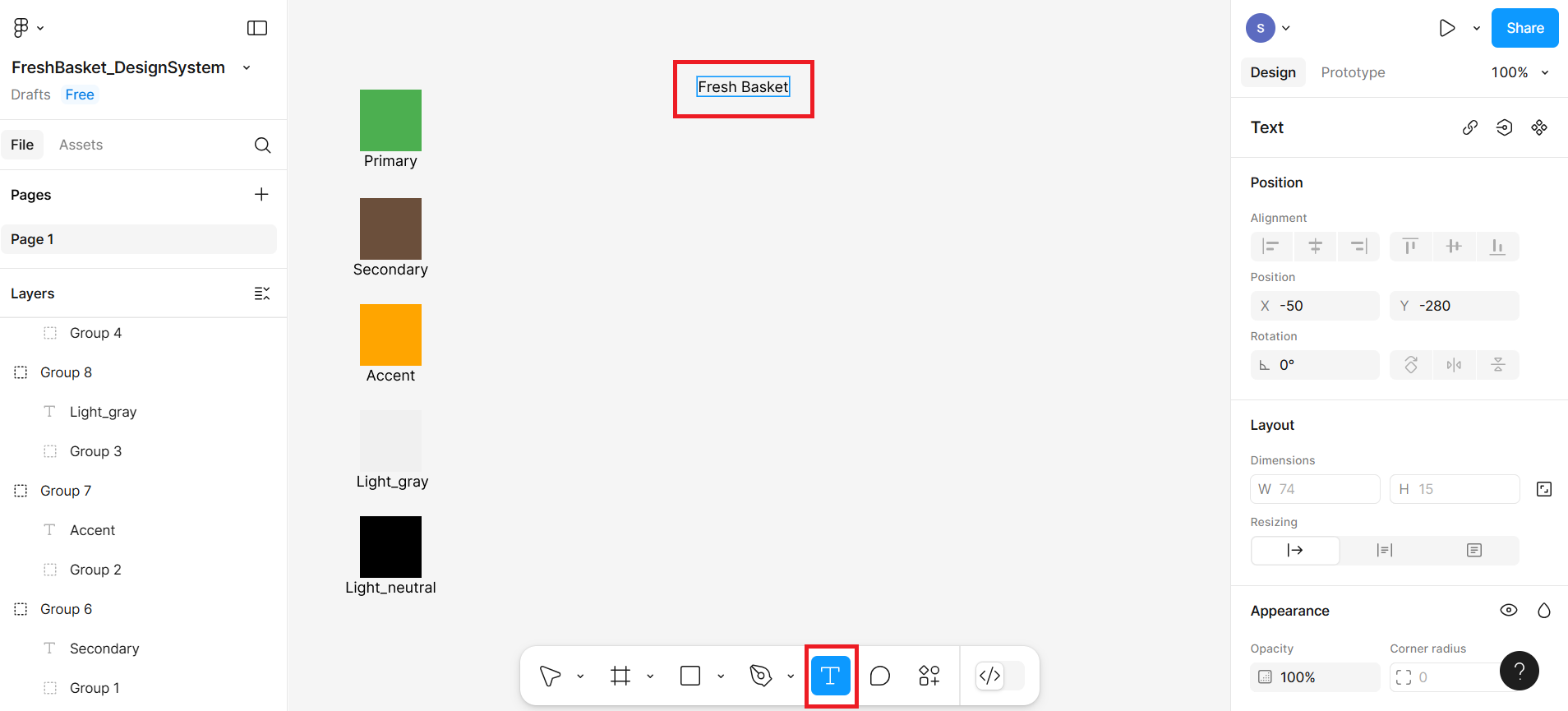
Repeat this to create 3 more separate text elements:
"Eat Healthy, Live Happy" → This will become your H2
"Fresh produce delivered to your doorstep." → This will become your Body
"20% OFF" → This will become your Caption
You should now have 4 different pieces of text on your canvas, stacked one below the other. In the right-hand sidebar, you can also see the typography section, using which you will create the custom typography system.
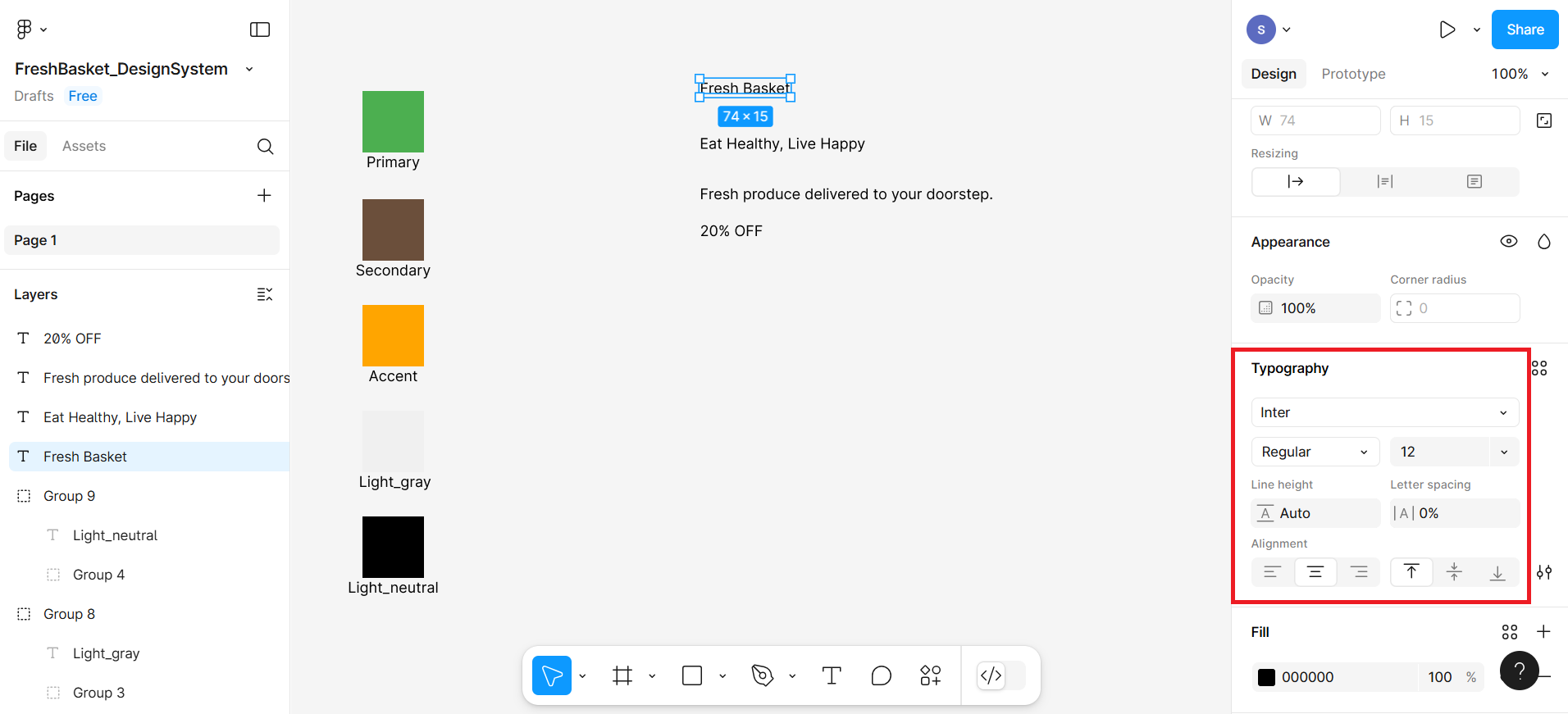
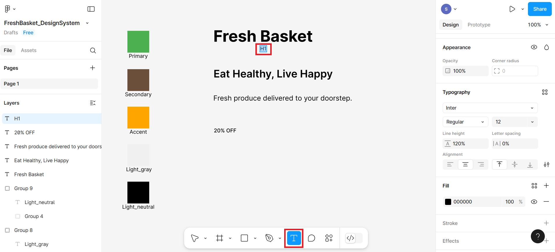
Step 2: Style each text element
Select the Fresh Basket text box and style it using the right panel:
Font: Inter
Size: From 12 px to 36 px
Weight: From Regular to Bold
Similarly style Eat Healthy, Live Happy as:
Font: Inter
Size: 24 px
Weight: SemiBold
Then style Fresh produce as:
Font: Inter
Size: 16 px
Weight: Regular
Now style 20% OFF as Caption
Font: Inter
Size: 12 px
Weight: Medium (or Bold)
These sizes and weights help visually organize your content and create a clear reading hierarchy.
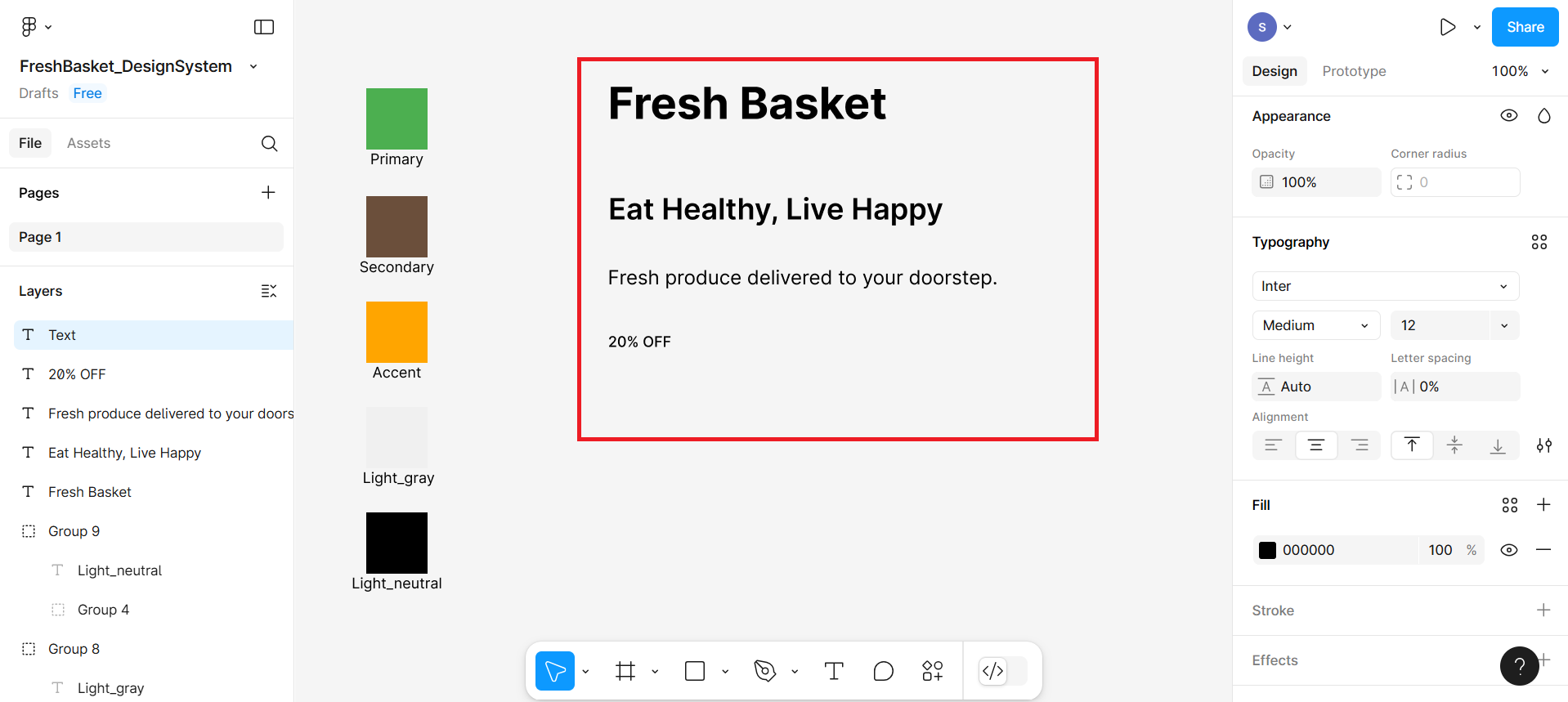
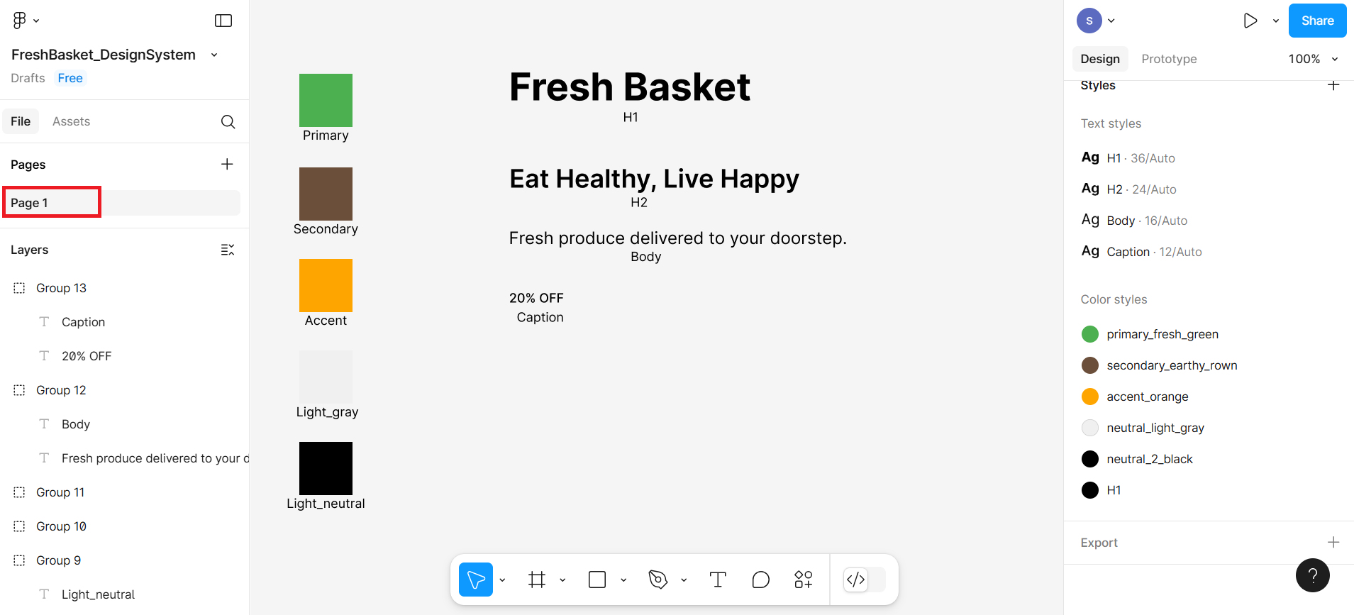
Based on the settings you made in the previous steps, all the text will look similar to the screenshot.
Step 3: Save text styles for reuse
- Select the textbox with text Fresh Basket. On the right panel, next to the word Typography, click the four-dot icon as shown at number 1 in the given screenshot. Then click the + (plus button) in the pop-up shown at number 2.
After clicking on the plus button, one more pop-up box will appear where you will give H1 as the name and then click on the Create Style button.
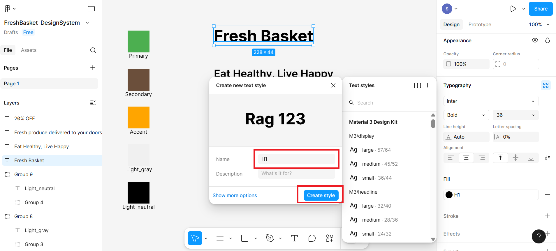
Repeat the same steps for the other text types, where you can name the others as H2, Body, and Caption.
Now all your typography styles are saved and ready to be reused across your designs with one click!
Step 4: Label your typography styles
Select T on bottom menu bar to activate the Text Tool and then write H1 below the first textbox
Adjust the size and position of the text so it appears clearly under each style.
To keep things organized, select textbox and its label (press shift key and then select both) , right-click, and select Group Selection. This groups the color and its label together so they move as one unit.
Congratulations
You've done it!
You now have:
A Color Palette saved as color styles
A Typography System saved as text styles
This is the core of any design system and sets you up perfectly for building consistent UI components like promo cards, landing pages, or buttons.
Summary
This lab taught you how to construct a basic design system in Figma by defining and saving color and typography styles. You began by creating visual color swatches and saving them as reusable color styles, then moved on to setting up text styles using consistent font sizes and weights for headings, body, and caption text. These styles now serve as the visual foundation of your UI project, helping you maintain consistency and save time in future design tasks. In the next lab, you'll build on this work by testing your choices for accessibility, ensuring that your design is inclusive for all users.
Practice Task
You've been hired to design a promo card for a fictional eco-friendly juice brand called Green Squeeze. This company emphasizes natural ingredients, sustainability, and vibrant energy. Your goal is to set up a mini design system for Green Squeeze using color styles and typography styles in Figma.
Part 1: Set up Your Figma File
Open Figma and create a new file.
Rename the file to: GreenSqueeze_DesignSystem
Set up your canvas for color swatches and typography.
Part 2: Create Color Palette (Use These Hex Values)
- Create 5 swatches, label and group them, and save them as color styles:
- Primary Green: #43A047
- Accent Yellow (for CTAs): #FFD600
- Earth Tone (Organic feel): #8D6E63
- Neutral Light: #FAFAFA
- Neutral Dark: #212121
- Label each one, such as Primary, Accent, Earth Tone, etc.
Part 3: Set Up Typography Styles
- Add these 4 text elements and create styles for each:
- "Green Squeeze" → H1
- Font: Inter, Size: 36px, Weight: Bold
- "Juice Up Your Day!" → H2
- Font: Inter, Size: 24px, Weight: Semibold
- "100% organic juices delivered fresh." → Body
- Font: Inter, Size: 16px, Weight: Regular
- "LIMITED OFFER" → Caption
- Font: Inter, Size: 12px, Weight: Medium Label each one (e.g., H1, H2, Body, Caption) and group accordingly.
- "Green Squeeze" → H1
Author(s)
Richa Arora